Executive summary
No design system, mid-production on a shipped VR game — and a team that needed one.
I joined Orcs Must Die: By the Blade at Teravision Games during mid-to-late production. There was a lot of interface work ahead — gameplay systems, inventory, world interactions, multiplayer, accessibility — and no design system to work from. Every new screen meant starting from scratch. My job was to change that. I built the UI design system, created reusable assets, documented the key features, and led a team of two designers through the rest of production. We shipped.
Project Snapshot
Role
UX Lead
Context
Mid-to-late production on a shipped VR game
Platform
Meta Quest (VR)
Team
UX/UI team of 3
Tools
Figma · Unreal Engine · Jira · Confluence · Adobe Suite
Main Challenge
No shared UI design system existed. Each new feature required starting from scratch, creating inconsistency and slowing implementation.
Key Deliverables
UI design system, reusable assets, interaction flows, feature documentation, accessibility review, UXR artifacts, QA support
Status
Shipped
Constraints
Meta Quest performance budget · small team · mid-to-late production entry · NDA restrictions on specific visual assets
My Ownership
I owned the UX/UI direction, system structure, player flows, interface logic, documentation strategy and design-system decisions for this project. I led a team of two designers, coordinated with game design, art, engineering, QA and production, and was responsible for translating gameplay needs into reusable UI components, interaction patterns and implementation-ready specifications. My role included not just creating assets, but making sure the team had a shared foundation to design, implement and review from.
Context
Designing for VR changes every assumption you bring from flat-screen work. You are not placing a screen inside an environment — you are placing something inside someone's physical space. On Meta Quest, every UI decision competes with the player's field of view, their hands, their sense of comfort, and the platform's performance budget. The interface had to earn every pixel it used.
The challenge
The real problem was not the list of features we needed to design. It was that without a shared system, every feature was a separate production problem. No shared naming. No shared components. No shared criteria for what "done" looked like. That created three compounding risks.
Slower implementation: each new feature needed UI support without shared criteria to reference
Inconsistent visual criteria: without a system, every screen could drift from the rest
More rework: design, implementation and review became harder to align across areas
My role
As UX Lead, I led the UX/UI direction for the project and coordinated the work of two designers. My responsibilities included:
- Creating the UI design system in Figma
- Designing reusable UI assets including containers, iconography and 2D animations
- Documenting features and interaction flows in Confluence
- Supporting Unreal implementation and QA review
- Writing UI copy for different systems
- Creating and supporting UXR artifacts such as player personas
- Participating in an external UXR process with Meta
- Prioritizing UX/UI work using product needs, game design requirements and RICE criteria
- Reviewing implementation quality, visual consistency, accessibility and heuristic alignment
Constraints
- Meta Quest platform limitations: performance budget, rendering constraints, comfort zones
- Small UX/UI team: three people covering multiple responsibilities simultaneously
- Recognizable IP style: system had to respect the franchise's established visual language
- Mid-to-late production timing: no opportunity to rebuild from scratch
- Implementation in Unreal: every Figma decision had to translate cleanly into the engine
- NDA-safe public presentation: detailed internals cannot be shown publicly
UX approach
1. Understanding the product and the medium
I started by reviewing the IP style, the current UI direction, the player needs and the constraints of designing for VR. In VR, every interface decision affects comfort, readability, attention, interaction and immersion differently than on a flat screen.
2. Mapping interface needs
I mapped the main UI needs across different systems: inventory, guide book, world interactions, level objectives, accessibility, multiplayer flows, weapon upgrades, trap upgrades and smooth turning. This helped identify where the team needed reusable criteria instead of isolated decisions.
3. Creating the UI system foundation
The system included buttons, containers, iconography, colors, typography, states, modals, notifications, feedback patterns, templates, variables and tokens. The first goal was a stronger Figma foundation. As production advanced, the system incorporated implementation notes to make the work easier to translate into Unreal.
4. Designing and documenting key systems
I created assets, flows, documentation, iconography and copy for several features. The most important value came from reusable assets and documentation: these helped the team align faster, reduce visual inconsistency and make implementation clearer across the different areas involved.
5. Supporting implementation and review
The work did not stop at Figma. I supported implementation review, QA passes, weekly playtests and feedback filtering from internal and external players. This helped connect design intent with what players actually experienced inside the headset.
Key decisions
These are the design choices that shaped the most important UX outcomes of the project.
The project needed UI support for many systems, but without shared criteria every new feature could become a separate production problem.
Built a reusable UI system with assets, states, containers, iconography, naming logic and Confluence documentation before scaling new feature work.
A system built early reduces friction later. Each new screen, component or review has a reference point instead of starting from scratch. The operational value is as important as the visual value.
Assets and documentation were being created in isolation, which slowed down implementation and created ambiguity across areas.
Structured Figma files with clear naming, correct dimensions and layered documentation so different areas could understand requirements without needing to ask.
The most valuable part of a design system is not the visual design. It is the way assets and documentation help a team work faster with less ambiguity.
In VR, a heavy or poorly placed HUD creates discomfort and distracts from the physical environment.
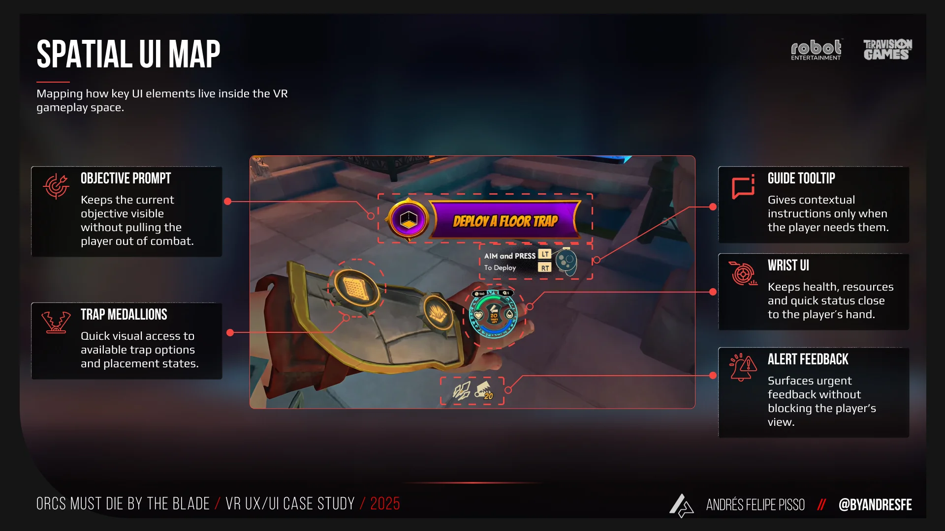
Kept the VR HUD light and intentional. For world objects and contextual actions, moved toward in-world feedback, contextual tooltips and haptic reinforcement instead of relying only on flat UI.
VR is not a flat screen. Interface elements compete with physical space for attention. A HUD that only shows what the player needs, when they need it, improves both clarity and immersion.
The game needed to communicate which objects were interactive, what state they were in and what action was required, without adding more weight to the HUD.
Created a contextual interaction language using animated tooltips, highlight color states and haptic feedback, all working together to communicate interaction affordance and state.
Multiple feedback channels working in parallel reduce the cognitive load on any single channel. Players with visual accessibility needs also benefit when feedback is not carried by color alone.
Player feedback from UXR sessions identified friction in inventory behavior, FTUX communication and control comfort that was not visible from design review alone.
Used UXR findings to prioritize real improvements: inventory behavior iterations, clearer FTUX communication, feature clarity fixes and smooth turning as a comfort and accessibility improvement.
UXR findings change the priority of what you fix. Smooth turning went from a nice-to-have to a real accessibility and comfort need based on what players reported in sessions.
Featured systems
Inventory
The inventory managed weapons and trinkets inside the VR experience. It needed to be accessible during combat, communicate the state of each object and represent the player's body placement across three slots: left shoulder, right shoulder and chest. After several iterations and user research sessions, the inventory evolved into a more flexible system with different states: a full silhouette for inspection moments, a compact version for active combat, an option to turn the UI off completely and haptic reinforcement for players who wanted a cleaner VR experience. This feature shows how design decisions were shaped by player needs, iteration and the specific conditions of VR.
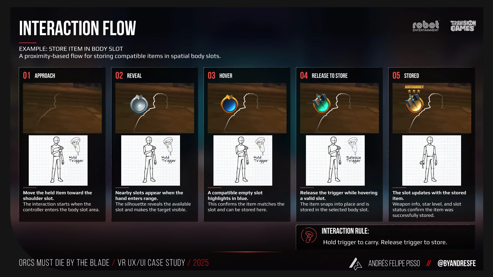
Inventory states adapted to different gameplay moments, from readable inspection to compact combat use.
Guide Book
The guide book was created to communicate level objectives without adding more elements to the HUD. The solution was a diegetic book that the player could invoke during gameplay. It included primary objectives, secondary objectives and level progress in a way that felt connected to the game world. Because it behaved as a world object, the player could interact with it, close it or throw it. The interaction used a hold action to reduce accidental triggers and make the input feel deliberate. This feature shows how a traditional UI need can become a more spatial and diegetic solution in VR.
World Interactions and Diegetic Feedback
The game needed a clear way to communicate which objects were interactive, what state they were in and what action was required. Instead of solving this only with static UI, we created several layers of feedback working together: animated contextual tooltips for different interactable objects, highlight colors to communicate interaction states, haptic feedback as reinforcement and a visual language that supported players with visual accessibility needs. This feature shows how multiple feedback systems can work in parallel to reduce confusion and help players understand the world without adding HUD weight.
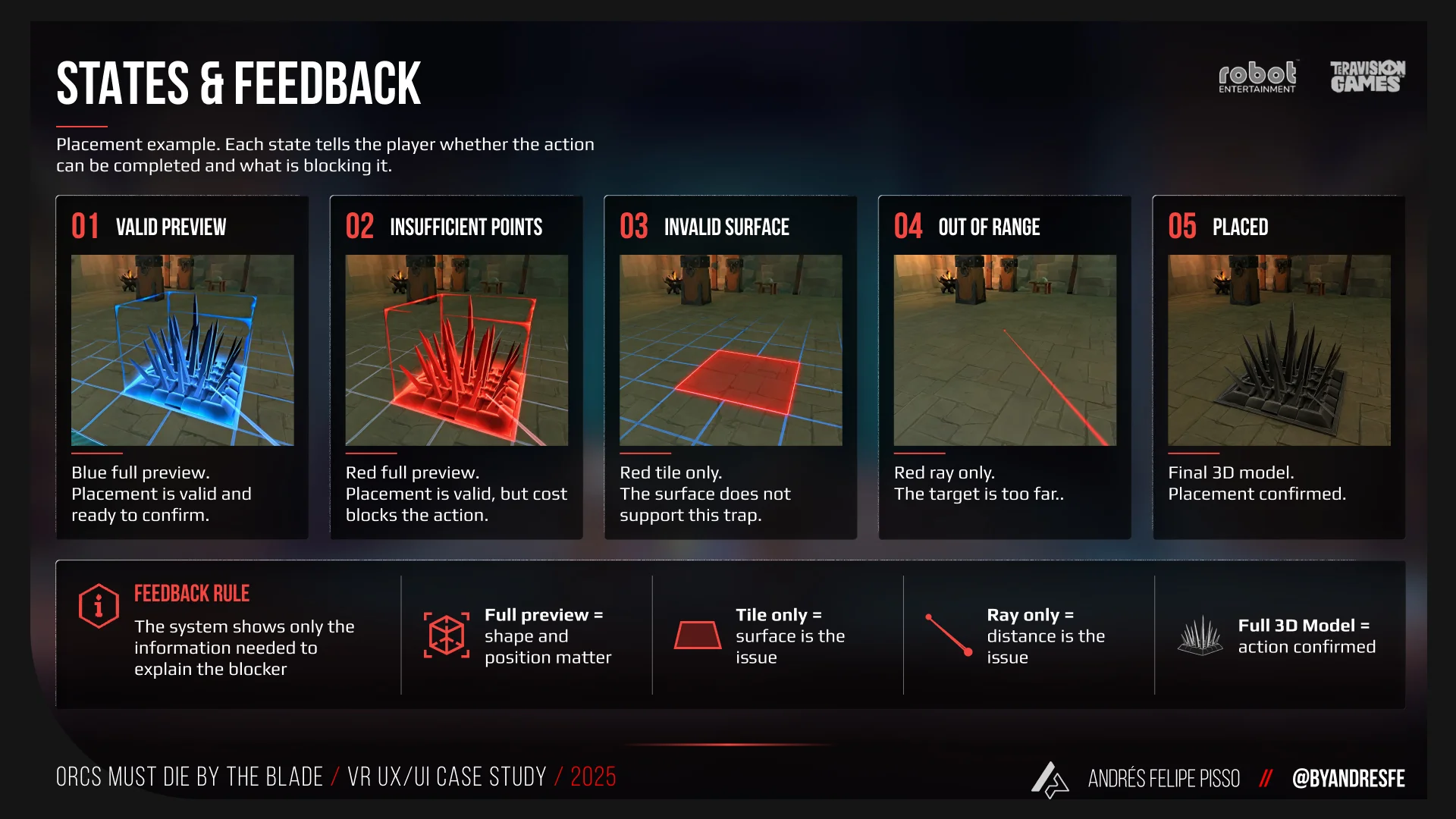
Contextual feedback helped players understand what they could interact with and how.
Before and after
The original interface direction had elements inspired by previous games in the franchise, but it did not yet have a clear system identity. There were problems with consistency, accessibility, legibility and implementation clarity. Because the original material should not be shown publicly, the comparison below describes the shift from a systems perspective.
- Scattered UI decisions with no shared reference
- No unified design system in Figma
- Slower implementation: each feature required starting fresh
- More visual inconsistency across screens
- Harder alignment between design, engineering and production
- Reusable assets with clear naming and correct dimensions
- Shared design system with components, states and tokens
- Faster asset production and implementation
- Stronger visual consistency across features
- Better alignment between design, engineering and production areas
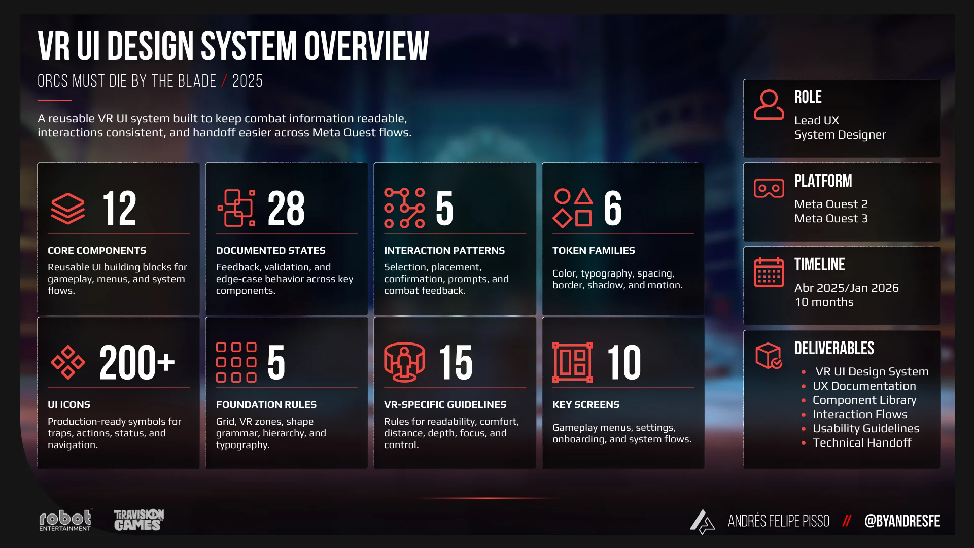
From scattered UI decisions to a shared system for design, documentation and implementation.
Deliverables
- UI design system in Figma with components, states, tokens and variables
- Reusable UI assets: containers, iconography, 2D animations
- Feature documentation in Confluence for all key systems
- Interaction flows for inventory, guide book, world interactions and onboarding
- UI copy for multiple game systems
- Player personas and UXR artifacts
- Implementation review and QA support inside Unreal
- Accessibility review and VR comfort guidelines
Outcome
The system did what systems are supposed to do: it made the team faster. Asset creation went from starting-from-scratch to working from a shared reference. Documentation meant engineering and QA could move without waiting for a designer to explain intent. The VR-specific decisions — the diegetic guide book, the contextual interaction language, the light HUD — gave players a cleaner experience without removing the information they needed. We shipped the game.
Impact / Evidence
Built a reusable UI system with shared naming, components, states and documentation so every new feature had a reference point instead of starting from scratch.
Applied VR-specific readability, comfort and accessibility considerations — including contextual interaction language, haptic reinforcement and a diegetic guide book — to reduce confusion without increasing HUD weight.
Defined reusable UI patterns and component logic that could be applied across gameplay, progression, world interactions and multiplayer flows.
Documented features, interaction logic, visual states, and implementation notes in Confluence so design intent was available to engineering, QA and production without additional back-and-forth.
Supported Unreal implementation review, QA passes and weekly playtests to connect design decisions with what players actually experienced inside the headset.
External UXR process with Meta · internal playtest feedback · QA review cycles · RICE-based prioritization to focus on highest-impact clarity improvements first.
Implementation & Handoff
The handoff focused on reducing ambiguity for implementation inside Unreal Engine. Each flow, component and screen state was documented with naming conventions, layout behavior, interaction logic, visual states, VR-specific notes and production constraints. Assets were structured in Figma with correct dimensions and clear layer organization so engineering and art could move from design intent to implementation with fewer interpretation gaps. I supported this process through direct implementation review and QA passes rather than treating it as a hand-off-and-forget step.
Research & Validation
This work was informed by player clarity goals, platform-specific VR comfort requirements, UXR sessions conducted with Meta, internal playtest feedback and production feasibility. In VR, interface decisions affect comfort, attention and immersion differently than on a flat screen — so every design choice was evaluated against both player clarity and physical experience. UXR findings directly shaped iteration priorities: inventory behavior, FTUX communication, smooth turning and control comfort were all improved based on what players reported in sessions, not from assumptions.
What I learned
VR made concrete something I already believed: clarity depends on context. A decision that works on a flat screen can become uncomfortable or misleading inside a headset. The interface is not just something the player sees — it becomes part of how they move through space and respond to the world. That changed how I thought about feedback, legibility, and the balance between UI and haptic reinforcement. The other thing I came away with: a system foundation matters more than I expected, and the cost of not having one shows up three months later. The pressure is always to ship individual features first. But every feature built without a shared reference creates rework down the line.
The most valuable thing I built on this project was not a screen — it was a shared reference point. A design system that let the team design, implement, and review from the same foundation. When that exists, decisions get faster, rework goes down, and disciplines can work in parallel without constant check-ins. I care about building the layer under the visuals: the rules, assets, states, and documented decisions that give a team something to build from. That is the work that makes everything else easier.
If my work fits your team or project, reaching out should take less than a minute.