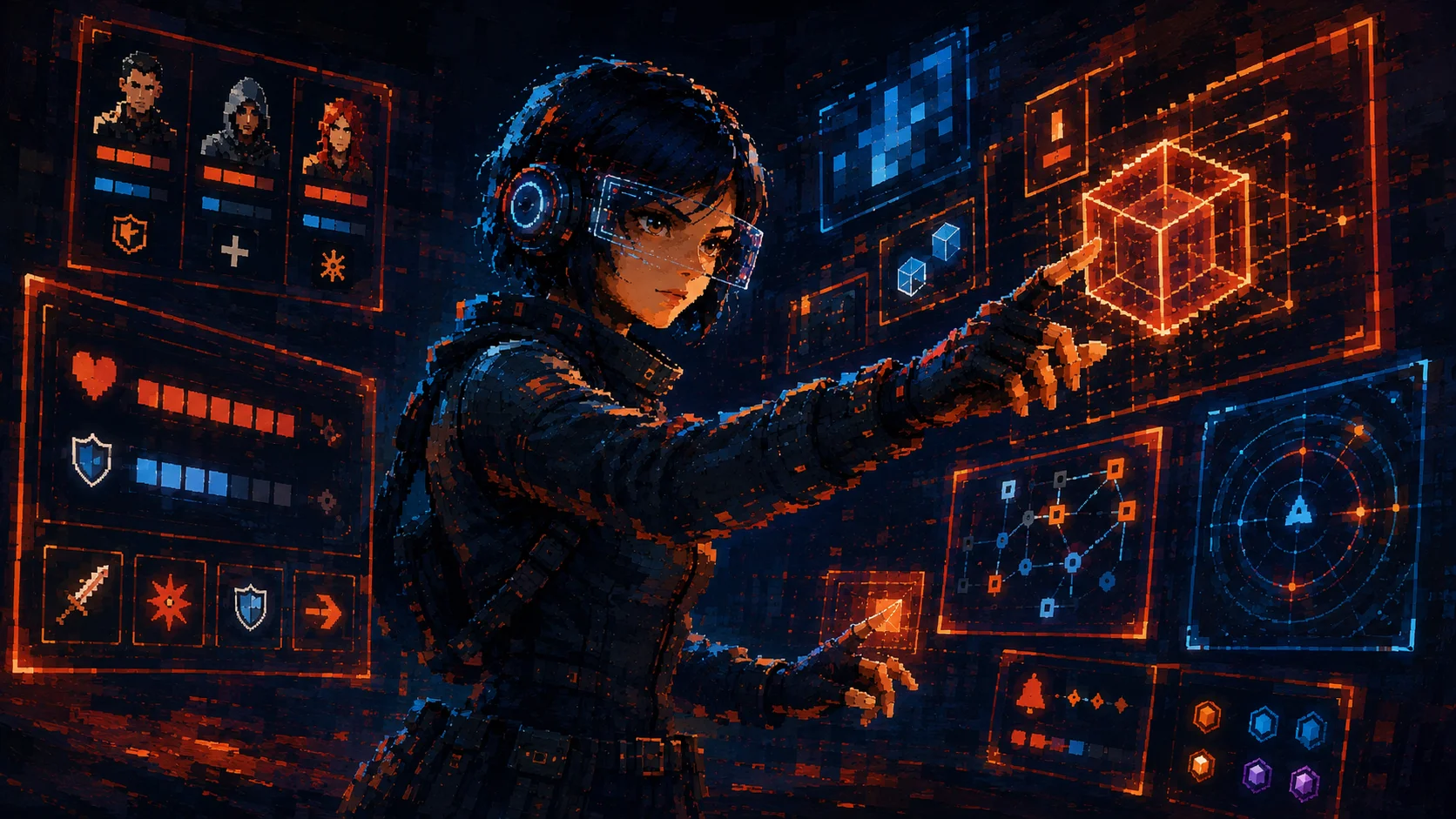
A game UI system is not just a set of nice screens. For me, it is the shared structure that keeps the interface understandable when the game grows, the states multiply, and the player still needs to make decisions fast.
A style guide can define colors, type, buttons, and visual rules. A component library can help the team reuse panels, buttons, cards, HUD elements, and menu patterns. But a real UI system goes further.
It explains how those pieces work together when the game is moving, when the player is under pressure, when a feature changes state, when content needs to scale, and when another designer or developer has to implement the same logic without guessing.
That difference matters in production. A lot of UI problems do not start because the screen looks bad. They start because the rules behind the screen are unclear. One modal behaves differently from another. One reward screen uses a different hierarchy than the rest of the economy. One HUD element changes state, but nobody documented when, why, or how.
A UI System Is a Decision System
For me, a strong game UI system should answer practical questions:
- ◆What information needs to be visible first?
- ◆What changes when the player is in combat?
- ◆What happens when a resource is missing?
- ◆How does the interface communicate danger, progress, reward, cooldown, failure, or recovery?
- ◆Which elements interrupt the player, and which ones should stay in the background?
- ◆What should be reused, and what needs a special rule?
These are not just visual decisions. They affect clarity, pacing, player confidence, and production speed. A good system helps the team make the same kind of decision twice without redesigning the logic every time.
What a Game UI System Usually Contains
- ◆Visual foundations: typography, color, spacing, icons, and layout rules
- ◆Reusable components: buttons, cards, tabs, modals, tooltips, HUD modules, meters, and reward blocks
- ◆States: default, hover, selected, disabled, locked, unlocked, active, completed, claimed, unavailable, and error
- ◆Interaction rules: what opens, what closes, what interrupts, what confirms, and what gives feedback
- ◆Motion behavior: transitions, emphasis, timing, entry rules, and exit rules
- ◆Content rules: title length, number formatting, rarity labels, reward names, and localization limits
- ◆Handoff notes: implementation details, edge cases, dependencies, and ownership
- ◆Decision logs: why a pattern exists and when it should not be used
If the team only documents what something looks like, future work depends too much on memory. When the team documents why the pattern exists, the system becomes something people can actually maintain.
The Real Problem Is Not Inconsistency
Inconsistency is visible. The deeper problem is uncertainty. When the team does not have shared UI rules, people start solving the same problem in different ways.
A developer has to ask what should happen in an empty state. A designer has to rebuild a modal because the previous one did not cover the new case. QA finds five versions of the same interaction. Localization breaks a layout because the text rules were never defined. A new feature ships with the right visual style but the wrong behavior.
That kind of friction is expensive because it does not always look like a design problem at first. It looks like implementation noise, review comments, bugs, small exceptions, and late polish. But the root is often the same: the interface did not have enough system behind it.
Game UI Has Extra Pressure
Game UI systems have a different level of pressure than many product interfaces. Players are often making decisions while moving, fighting, scanning, comparing, recovering, spending, or reacting. The UI has to work in menus, but also inside loops.
A health bar is not just a rectangle with color. It has rules for damage, healing, low health, shields, armor, temporary buffs, animation, warning states, and visibility. A reward card is not just a container. It has rules for rarity, quantity, ownership, claim status, missing inventory space, duplicates, conversion, and emotional emphasis.
What I Usually Check First
- ◆Can the team explain when each pattern should be used?
- ◆Can the interface communicate state without relying on a designer being present?
- ◆Can the system survive new content without breaking clarity?
This is especially visible in HUDs, inventory systems, stores, progression screens, and LiveOps surfaces. These areas grow fast. If the rules are weak, every new feature adds a little more friction.
A Small Example
Imagine a game has three different reward screens: one after combat, one after completing a quest, and one after opening a chest. Visually, they may all look good. But if each one uses different rules for rarity, claim state, item ownership, animation, duplication, and confirmation, the player has to relearn the meaning of the interface again and again.
A UI system does not remove flexibility. It protects meaning. It gives the team enough shared structure for new screens to feel intentional instead of improvised.
The Takeaway
A good game UI system is not there to make every screen look the same. It is there to make every decision feel coherent. It reduces guesswork for players. It reduces ambiguity for teams. It makes handoff cleaner, QA sharper, and future features easier to integrate.
The real value of a UI system is not visual consistency alone. It is production clarity: fewer guesses, cleaner handoff, and decisions the team can reuse.