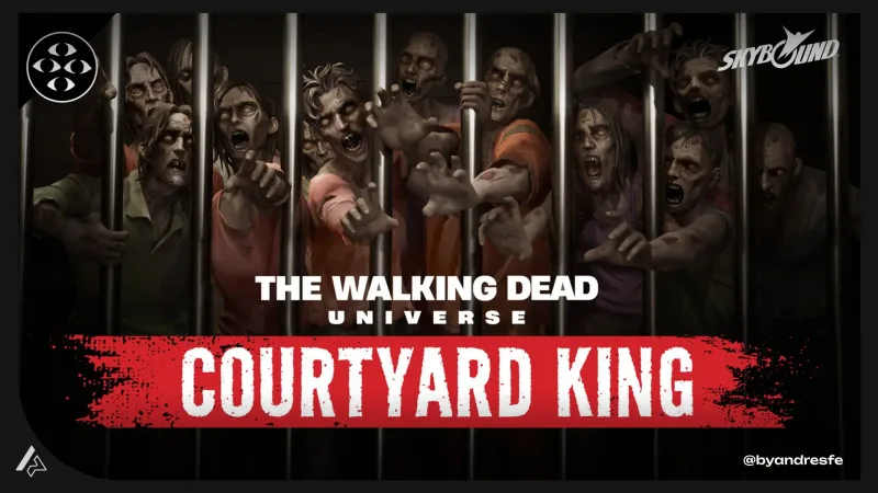
Executive summary
Designing survival feedback that preserves The Walking Dead's tension — inside Fortnite's technical constraints.
The Walking Dead: Courtyard King puts players inside a survival experience where tension is the point — not the kind that comes from difficult mechanics, but the kind that comes from not knowing if you will make it through the next moment. My work was the interface layer: how players read threat, understand their resources, and stay aware of their teammates — all without the game stopping to explain itself, and without breaking the IP's atmosphere. Some details are NDA-limited. The design thinking is here.
Project Snapshot
Role
UX/UI Designer
Context
UEFN experience inside Fortnite — Walking Dead IP
Platform
UEFN / Fortnite
Team
Cross-functional: design, art, engineering
Tools
Figma · UEFN
Main Challenge
Communicating survival stakes under IP tone constraints and UEFN technical limits simultaneously
Key Deliverables
HUD logic documentation, threat feedback system, resource state visual language, cooperative action UI framework, implementation notes
Status
In production / NDA-safe
Constraints
UEFN UI layer restrictions, Fortnite native HUD zones, Walking Dead IP tone requirements, NDA restrictions on mechanic details
My Ownership
I owned the HUD logic and feedback system design end-to-end. This included defining threat communication rules, resource state visual language, cooperative action clarity, and the documentation that translated those decisions into engineering-ready specifications. I was the primary interface designer navigating the triple constraint of Walking Dead IP tone, Fortnite native HUD zones, and UEFN technical limitations. Design decisions were not made in isolation — I collaborated with art and engineering at each step to confirm what could be built before committing to a direction.
Context
Players who enter a Walking Dead experience bring expectations built over years of the franchise: scarcity matters, danger is real, numbers on a screen break the mood. The interface either honors that emotional contract or it works against it. On top of that, UEFN means Fortnite's native HUD is always there. You cannot remove it. You design around it — which means every custom UI element has to justify itself against what is already occupying the screen.
The challenge
Too much UI and the world loses its danger. Too little and players make uninformed decisions that frustrate rather than challenge. The line between those two outcomes is the design problem — and it is a narrow line. Working inside UEFN meant I also had hard limits on what custom UI could actually do: placement zones, font rendering, the screen real estate that Fortnite's native HUD already occupies. The solution had to fit inside all of that while still feeling native to The Walking Dead.
My role
I designed the HUD logic and feedback systems for the player-facing interface. My work covered threat indicators, resource communication, and the visual hierarchy for cooperative actions. I collaborated with art and engineering on what could be executed within the production timeline.
Constraints
- The Walking Dead IP tone requirements: the interface could not feel "gamey" or break the tension
- UEFN limitations on custom UI placement and font rendering
- Fortnite native HUD occupies fixed screen zones
- NDA restrictions on specific mechanic and asset details
- Cooperative experience design: UI had to communicate individual and group state simultaneously
UX approach
Atmosphere-safe feedback design
Established a principle that every interface element had to earn its presence. If a piece of information could be understood through environment or sound design, it did not need a UI layer. This kept the screen surface clean while preserving survival tension.
Threat communication without noise
Designed a threat feedback system that used position, intensity, and timing rather than explicit numeric displays. Players received directional indicators and state signals without being pulled out of the experience by a traditional health bar.
Resource legibility under pressure
Resource state needed to be readable in under a second during high-stress moments. Simplified the visual language to essential states: sufficient, low, critical. Each state had a distinct visual treatment that worked in both lit and dark environments.
Cooperative action clarity
Designed visual communication for cooperative moments: shared objectives, support actions, and teammate state. Balanced showing enough information to coordinate without creating information overlap between individual and group needs.
Key decisions
These are the design choices that shaped the most important UX outcomes of the project.
Traditional health and resource displays broke the survival tension and made the experience feel like a conventional game rather than a survival narrative.
Replaced explicit health displays with physical and environmental indicators calibrated to the IP's tone. Resource states communicated through scarcity signals rather than numeric values.
The emotional contract of The Walking Dead is about felt danger, not managed numbers. UI that surfaces statistics removes the player from that emotional frame.
In cooperative scenarios, players were missing teammate distress signals because individual threat was consuming their full attention.
Designed a peripheral awareness system that created distinct visual signatures for teammate critical states, positioned outside the primary threat zone.
Peripheral placement respects the player's primary attention zone while ensuring cooperative-critical information is visible without requiring active monitoring.
Deliverables
- HUD logic documentation and safe zone rules
- Threat feedback system specifications
- Resource state visual language
- Cooperative action UI framework
- Implementation notes for engineering
Outcome
The interface communicated survival state without breaking atmosphere. Threat read through position and intensity — not health bar numbers. Resources showed as essential states: sufficient, low, critical. Teammate awareness lived in the peripheral zone, away from the player's primary threat focus. Specific metrics are NDA-restricted. What I can share is the design problem, the constraints I navigated, and the decisions I made under a three-way tension between IP tone, platform limits, and player clarity.
Impact / Evidence
Delivered complete HUD logic documentation, safe zone rules and feedback system specifications within the production timeline, giving engineering a clear implementation reference
Replaced explicit numeric health and resource displays with atmospheric indicators calibrated to Walking Dead tone — communicating survival state without pulling players out of the tension
Established IP-consistent interface principles: every UI element had to earn its screen presence. That filter reduced visual noise while preserving the emotional contract of the franchise
Delivered HUD logic docs, threat specs, resource state visual language and cooperative UI framework — each with implementation context for engineering and notes on UEFN-specific constraints
Aligned design decisions to what UEFN technically permitted before committing to specs, avoiding revision cycles caused by platform limitations discovered late
NDA-limited. Outcome metrics are not available for public sharing. The evidence here is the design problem, the constraint navigation, and the type of decisions made under a three-way tension between IP tone, platform limits, and player clarity.
Implementation & Handoff
Handoff consisted of HUD logic documentation with explicit safe zone rules, threat feedback system specifications, resource state visual definitions, and cooperative action UI notes. Each deliverable included implementation context: what the design intended, what alternatives existed if a UEFN constraint blocked the primary approach, and what behavior to validate during QA. Engineering notes were written to work within the platform limitations — not to describe an ideal that could not be built.
Research & Validation
Research for this project was primarily competitive and constraint-driven. I analyzed how survival games communicate threat and resource state without explicit numeric displays, reviewed the Walking Dead franchise visual and tone conventions, and assessed what UEFN technically allowed within its UI layer. I worked closely with art and engineering to validate which design directions could be executed within the platform constraints before finalizing specifications. The research goal was not aesthetic — it was understanding which interface signals work under stress, in the dark, with limited screen real estate, and without breaking the IP mood.
What I would check next
Survival UX benefits from playtest data focused on moments of player confusion versus intended tension. I would want to distinguish between "confused and frustrated" and "tense and engaged" in session observations, then use that to calibrate exactly how much information the interface needs to surface.
Survival UX is about calibration. Communicate too much and you break tension. Communicate too little and players feel cheated. The right amount is the amount that keeps players making informed decisions while still feeling like every choice carries weight. This project also shows how I work when constraints do not have obvious solutions — IP tone, UEFN technical limits, and Fortnite's native HUD all pulling in different directions at once. Those constraints did not cancel each other out. They shaped the solution.
If my work fits your team or project, reaching out should take less than a minute.