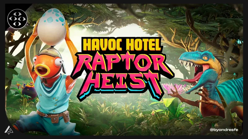
Executive summary
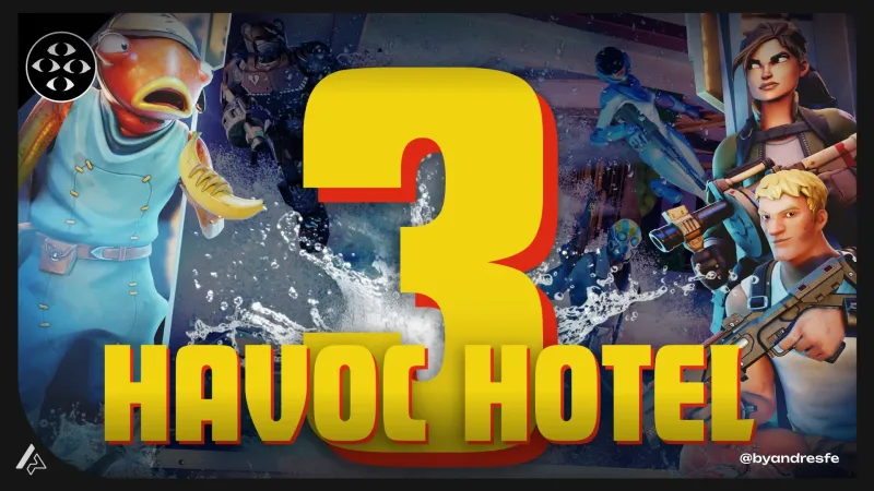
Designing run clarity and heist tension for a roguelike inside the Havoc Hotel universe.
Raptor Heist stacks a heist structure on top of a roguelike loop. Players plan, execute, get caught or escape, come back stronger. The tension depends on the player always knowing their risk level — and the game never having to stop to explain it. My work was the UX/UI layer: orientation, reward feedback, alert escalation, and the post-run screen that keeps players coming back. The challenge was keeping all of that readable at Fortnite pace, inside UEFN constraints.
Context
Roguelikes work because players feel in control even when they fail. Every run is a decision tree: go here, take this upgrade, avoid that risk. When the interface is unclear, that feeling breaks — the player does not feel like they made a bad decision, they feel like the game did not tell them something it should have. Heist adds a planning and timing layer on top of that. The interface has more to communicate, and less screen space and player patience to communicate it with.
The challenge
At any decision point in Raptor Heist, a player needs to know their objective, their resources, their current alert level, and their exit options. Add a Fortnite-native audience that expects fast reads — not menus, not tutorials — and you have a real information hierarchy problem. Too much visible information slows the heist momentum. Too little and players make blind decisions that break the skilled-thief fantasy. The game should feel like skill, not like guessing.
My role
I designed UX/UI systems for orientation, reward communication, progression tracking, and pacing clarity. I worked within UEFN constraints and collaborated with the design and art teams on implementation feasibility.
Constraints
- UEFN device system limitations on custom UI placement
- Fortnite native HUD occupies core screen zones
- Roguelike run structure requires persistent state communication without UI overload
- Heist pacing requires tension-aware feedback design
- Player base is Fortnite-native: expects fast reads, not deep menus
UX approach
Run state visibility
Designed a persistent run status panel that showed the three most critical variables at all times: objective progress, resource level, and alert status. Everything else was accessible on demand. This reduced cognitive load while keeping players oriented during fast-paced heist sequences.
Reward clarity at collection
Designed the reward feedback system for each heist loot collection: immediate visual confirmation, brief state update, and a post-run summary that helped players understand what they had accumulated and what it unlocked. Clear reward feedback is the core of roguelike retention.
Alert escalation as readable tension
Built an alert escalation system where the visual feedback changed in response to how close the player was to being detected. Three distinct states with clear visual separation made the heist risk legible without requiring players to watch a hidden meter.
Run-to-run progression communication
Designed the post-run screen to show what changed, what was unlocked, and what the next objective was. Roguelike retention depends on the player feeling momentum between runs. The post-run screen needed to make that momentum visible.
Key decisions
These are the design choices that shaped the most important UX outcomes of the project.
Alert state was changing during sequences but players did not realize the change until they were already caught, which created frustration rather than tension.
Added a proactive alert signal that communicated escalation before the threshold was crossed, giving players a decision window to change behavior.
Frustration in games usually comes from unclear consequence, not from difficulty. If the player understands that the alert is rising, they can choose to act. If they do not understand until they fail, the UX carries the blame.
The post-run summary was showing all progression data at once, which caused players to skim and miss meaningful unlocks.
Restructured the post-run flow to reveal information in sequence: run result, then key achievements, then progression update, then next objective. Each beat had a brief pause.
Staged reveals give players time to process each piece of information and feel the reward properly. Dumping all data at once treats the post-run screen as a receipt rather than a moment.
Deliverables
- Run state UI system with component states
- Reward feedback sequences and timing specs
- Alert escalation visual language
- Post-run screen flow and information architecture
- UEFN implementation notes and zone maps
Outcome
Raptor Heist shipped. The alert escalation system — which signaled rising risk before the threshold hit — got called out specifically in team reviews as a clarity improvement over the prototype. Players could choose to act on the warning instead of reacting to getting caught. The post-run screen structure carried forward into later experiences in the franchise.
What I would check next
I would instrument the exact moment players trigger detection versus the moment they first see the alert signal, and look at whether players who see the proactive signal respond differently than those who miss it. Run-length data would tell us whether earlier alert awareness changes player strategy in a meaningful way.
Run-based games put the interface under a specific kind of stress. Something that reads clearly on run one has to read just as fast on run twenty — after the player has learned enough to skim. Designing for that repetition means getting the information hierarchy right from the start, not just making the first session feel good. The same challenge shows up anywhere a user returns to a feature repeatedly: dashboards, onboarding flows, notification systems. The question is always whether the system stays readable when the novelty is gone.
If my work fits your team or project, reaching out should take less than a minute.