Executive summary
Building shared-state UI systems for a co-op roguelike franchise across multiple Fortnite releases.
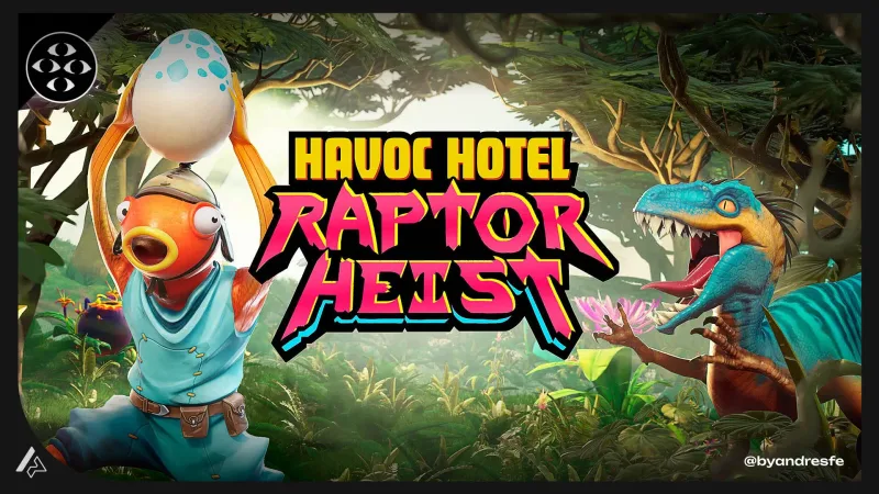
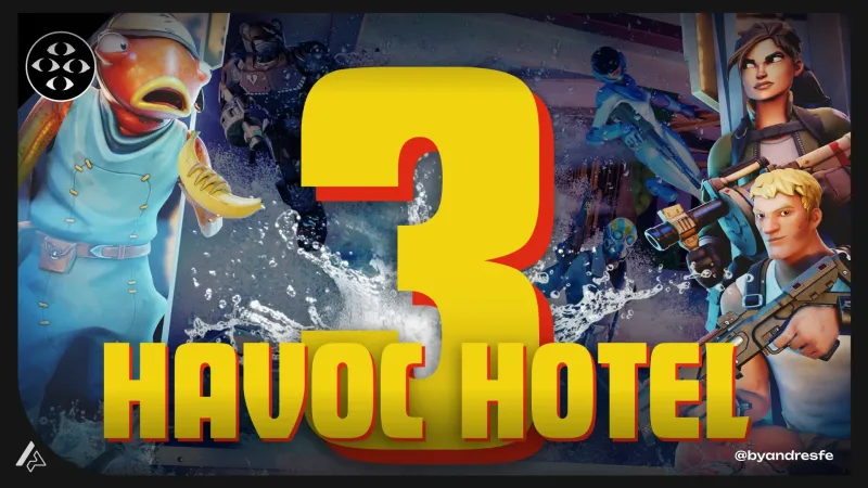
Havoc Hotel is a franchise — multiple releases, same universe, players who return already knowing the layout. My work was building the UI systems that connected those releases: visible economy, co-op state communication, combat feedback hierarchy, and a component library that reduced design-to-implementation time on each new entry. The challenge of franchise UI work is designing for two audiences at once: first-time players who need clarity, and returning players who need speed.
Context
Co-op roguelikes create a split-attention problem by design. Each player manages their own resources, decisions, and position — while also staying aware of what the group needs. The interface has to serve both layers simultaneously, without one interfering with the other. Inside a franchise, there is an additional layer: each new release starts from a player expectation shaped by the previous one. The UI has to feel consistent enough that returning players are oriented, and clear enough that new players are not lost.
The challenge
Solve individual clarity at the expense of group awareness and players stop rescuing teammates in time. Solve group awareness at the expense of individual clarity and players lose track of their own survival. Both outcomes break the co-op experience — just in different moments. The design problem was finding a visual grammar that served both layers without them competing for the same attention at the same time.
My role
I owned interface systems for visible economy, reward communication, and combat readability. I worked across multiple releases in the franchise, contributing to component architecture, state definitions, and design documentation that the team used across releases.
Constraints
- UEFN UI constraints: limited custom overlays without impacting performance
- Co-op sessions require simultaneous individual and group information
- Roguelike structure demands run-persistent state communication
- Fortnite player base expects fast reads with minimal tutorial dependency
- Franchise continuity: UI decisions needed to hold across releases
UX approach
Visible economy design
Designed the upgrade and reward economy to be legible before purchase decisions were made. Players could see the consequence of a choice before committing. This reduced buyer's remorse mechanics and kept the session pace high.
Co-op state communication
Designed a layered approach to group information: a persistent group health indicator in the peripheral zone, individual resource indicators in the primary zone, and a shared objective tracker at the top edge. Each layer had a distinct visual grammar so players could parse group state without losing individual context.
Combat readability at speed
Established feedback hierarchy for combat: critical threat signals, ability state, resource level, and group distress in order of urgency. Each level had a distinct visual intensity so players could triage information at the pace of combat.
Difficulty scaling feedback
Designed visual communication for how difficulty changed between runs. Players who understand the scaling system make better upgrade decisions and re-engage more readily. Making the curve legible reduced disorientation in later-stage runs.
Key decisions
These are the design choices that shaped the most important UX outcomes of the project.
Upgrade choices were being made quickly without players understanding the consequence, leading to post-choice confusion and disengagement from the progression system.
Designed upgrade cards to surface the most actionable information first: what changes, how immediately, and at what cost. Buried secondary stats behind an expandable detail state for players who wanted depth.
Speed and depth are both valid player approaches to upgrade systems. The interface should serve the fast player by default and the deep player on demand. Surfacing everything at once serves neither.
Group distress signals were being missed during intense combat because players were focused on their own survival.
Added a distinct audio-visual cue for teammate critical state, positioned in the far peripheral zone with a brief animation that did not compete with combat-critical information.
Co-op games fail when players cannot rescue teammates in time because they did not see the signal. The cue needed to be noticeable without being so loud that it created false urgency during normal play.
Across multiple releases, small UI inconsistencies were creating player confusion as the franchise grew.
Established a UI component library and state documentation system that defined shared patterns for the franchise, with clear guidelines for when elements could vary per release.
Franchise continuity is a form of player trust. Players who know where to look in one Havoc Hotel release should be oriented in the next. Shared patterns reduce re-learning time and reinforce brand coherence.
Deliverables
- Co-op UI system with individual and group state layers
- Visible economy component design and specs
- Combat feedback hierarchy documentation
- Upgrade card component with state definitions
- Franchise UI component library (cross-release)
- UEFN implementation guides
- QA notes for UI state coverage
Outcome
Multiple Havoc Hotel releases shipped. The franchise component library meant each new release started from a shared reference instead of from scratch — that is directly measurable in design-to-implementation time. The co-op state communication system got called out in community playtests: players specifically mentioned knowing their teammates' state as a strength of the experience.
What I would check next
Long-term franchise UX work benefits from cross-release player behavior analysis. I would want to understand how players who have played multiple releases navigate the UI versus first-time players, and whether the component library is creating meaningful consistency from the player's perspective.
Co-op UI is a shared-state problem before it is a visual one. Each player needs individual clarity and group awareness, and neither layer should require active monitoring — it should just be there, readable without looking for it. Designing that across multiple franchise releases adds a continuity dimension: the solution has to hold up not just in one game, but as a system that players can rely on each time they come back. That is a different kind of design constraint than a single-product problem, and it is one I found genuinely interesting to work through.
If my work fits your team or project, reaching out should take less than a minute.