Executive summary
A year building a mobile roguelite from concept to prototype — core loop, systems, UX, and everything in between.
Zomvilles was Piximeta's take on the hybrid-casual roguelite genre — zombie survival meets upgrade-and-survive loop, inspired by Survivor.io and Vampire Survivors. I joined as Lead Game Designer and spent a year turning an early idea into a playable prototype: core loop, skill systems, progression, UX flows, combat balance, and documentation. The launch was paused before we got live data. So this case is about the product work itself — how we structured a multi-system mobile game from the ground up, and what I learned from doing it.
Project Snapshot
Role
Lead Game Designer
Context
Mobile hybrid-casual roguelite prototype — Piximeta
Platform
Mobile (Unity)
Team
9 people — design, art, development, stakeholders
Tools
Figma · Jira · Wiki/GDD · Unity · Excel · Machinations · Adobe Suite
Main Challenge
Turning a complex multi-system roguelite into a structured, buildable, and player-readable mobile product for a team of nine
Key Deliverables
30+ UX flows, 100+ wireframes, 117+ wiki subsites, 650+ documents, 60+ stakeholder presentations, 600+ slides
Status
Prototype stage — launch paused before live data
Duration
1 year
My Ownership
I was the Lead Game Designer for the full prototype. My ownership covered the core loop definition, system architecture, individual screen design, GDD/Wiki documentation structure, and the stakeholder presentation cycle. I ran the UX flow work and the wireframe system. This was not a supporting design role — I was the primary design voice for how the product worked, how it communicated with players, and how it was understood by the team. Every major system decision, documentation structure, and product direction discussion ran through my design work.
Context
The fantasy was simple: survive waves of enemies, pick upgrades, get stronger, face harder enemies, pick more upgrades, survive longer. The design problem was making that loop feel different every run — different characters, skills, upgrade combinations — without making the product feel complex for a hybrid-casual mobile audience. Simple loop. Layered depth. Readable on a small screen under fast combat. That was the product brief.
The challenge
A roguelite can collect a lot of systems without any of them connecting. Skills, enemies, chests, bosses, inventory, upgrades, characters, missions, economy. Without a clear core loop as the anchor, features multiply and the player has nothing to return to. The second challenge was communication. Nine people, many concurrent systems, short-notice decisions. Without structure, different disciplines end up building from different assumptions about how things connect.
Product clarity: defining how the game worked as a repeatable mobile roguelite experience.
Player clarity: helping players understand progression, skills, inventory, character selection and in-run decisions.
Team clarity: documenting systems well enough for design, art, development and stakeholders to stay aligned.
My role
As Lead Game Designer, I worked across the product structure and design documentation of the prototype. My responsibilities included:
- Designing and documenting core mechanics
- Structuring the main game loop and progression systems
- Designing skills, combat logic and balance foundations
- Supporting UX flows and interface structure
- Creating and reviewing wireframes and HiFi UI screens
- Working on character selection, inventory, random card systems, HUD and progression screens
- Supporting narrative systems, missions, events, dialogue and localization
- Creating documentation through Wiki and GDD structures
- Preparing presentations for stakeholders
- Supporting monetization and product direction discussions
- Aligning design decisions with a multidisciplinary team
Constraints
- Mobile-first design: the experience had to be readable and actionable on a small screen under fast combat conditions
- Hybrid-casual audience: mechanics needed depth for engaged players without overwhelming new ones
- Prototype scope: design had to prioritize what made the core loop playable and communicable
- Team of nine: documentation had to be clear enough for design, art, development and stakeholders to stay aligned without constant back-and-forth
- Many concurrent systems: core loop, skills, progression, inventory, narrative, events and monetization all needed to connect without collapsing into complexity
UX approach
1. Defining the product foundation
The first layer was defining what the game was at its core: a mobile roguelite with short sessions, repeated runs, upgrades, character variety, combat escalation and progression over time. That meant designing how players enter a run, survive, choose random upgrades, use skills, manage resources, unlock content and return stronger.
2. Structuring systems and progression
The game needed systems that could scale beyond a first prototype. This included character progression, skill options, inventory, random card rewards, enemy escalation, boss encounters and economy considerations. The goal was to create systems that supported variety without making the product hard to understand.
3. Translating systems into UX flows
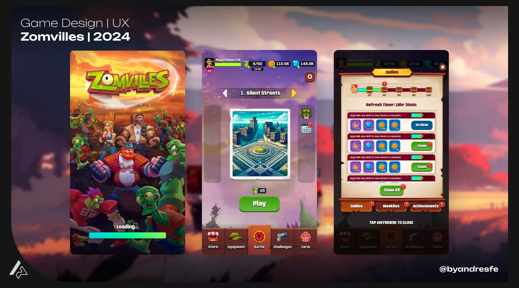
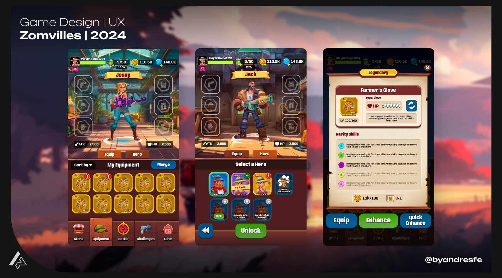
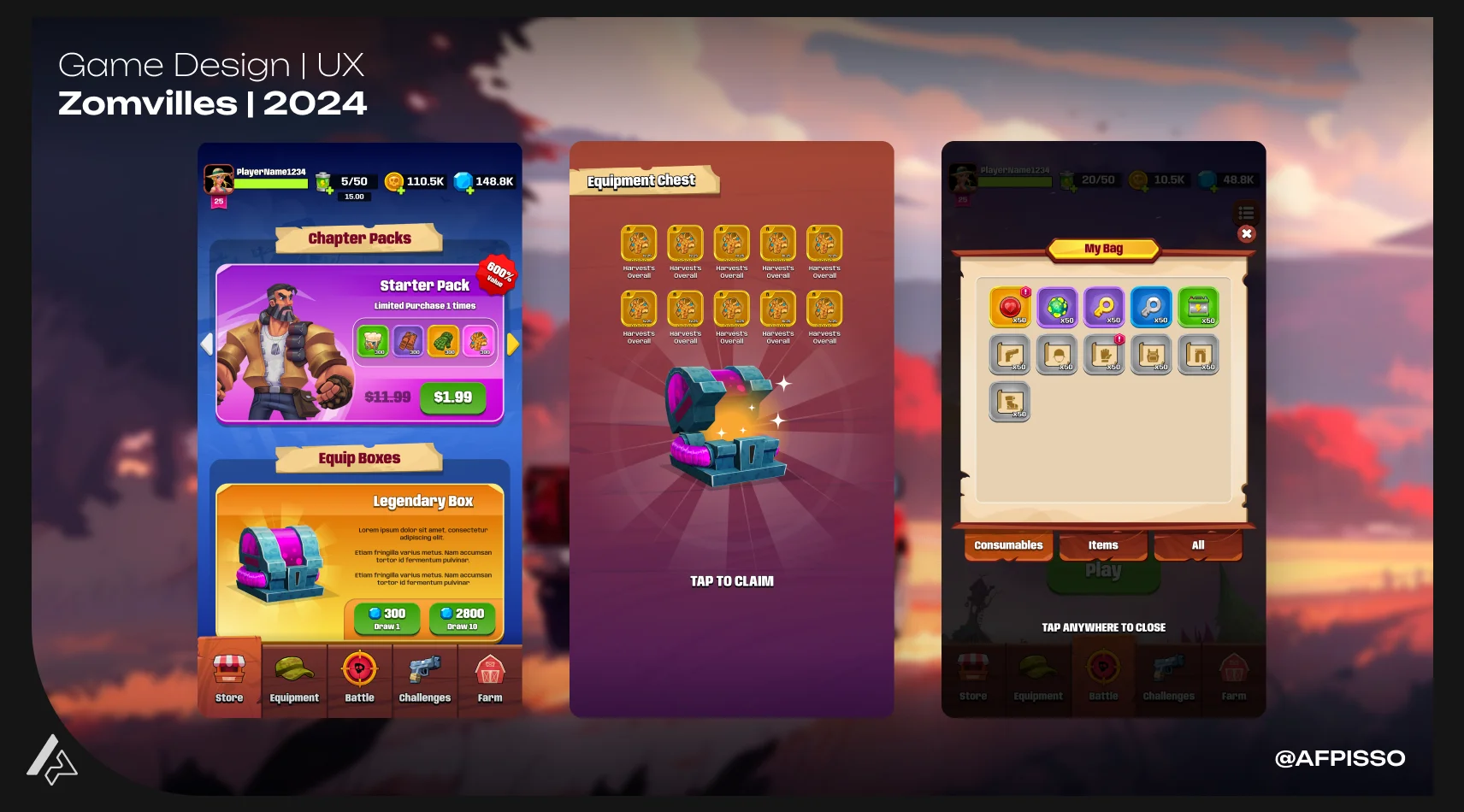
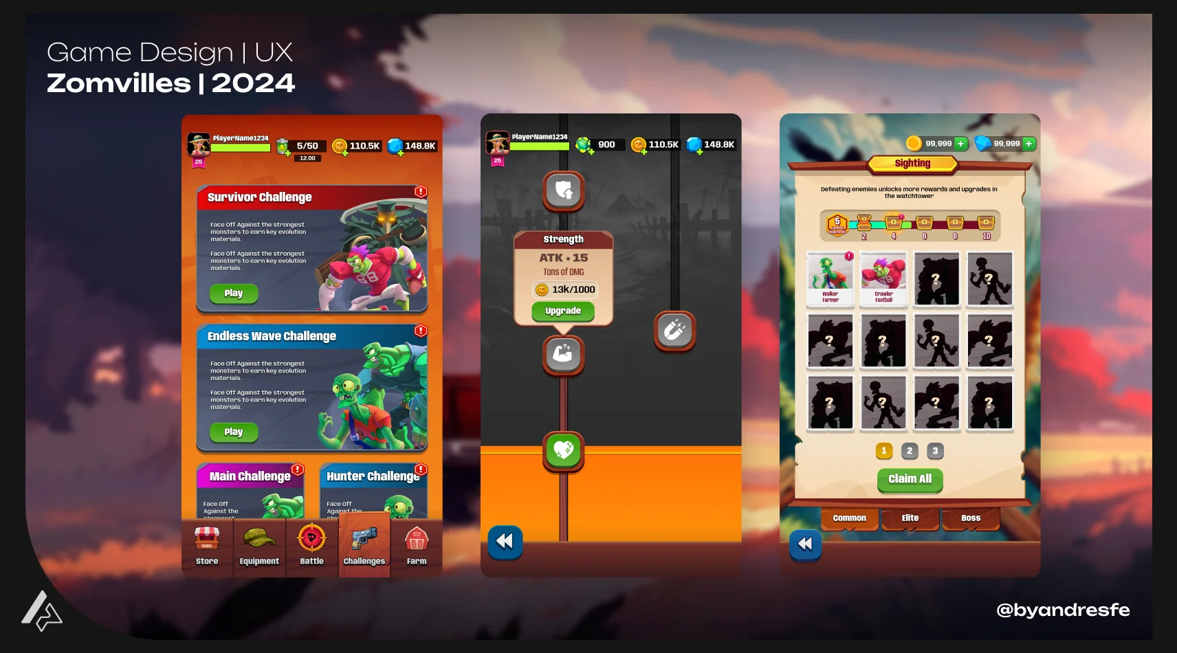
Once the systems were defined, they needed to become usable flows. I worked on flows for different parts of the experience, including character selection, inventory, in-run choices, rewards, HUD states and progression screens. The project included more than 30 user flows and more than 100 wireframes, which helped turn abstract systems into concrete player-facing interactions.
4. Documenting for team alignment
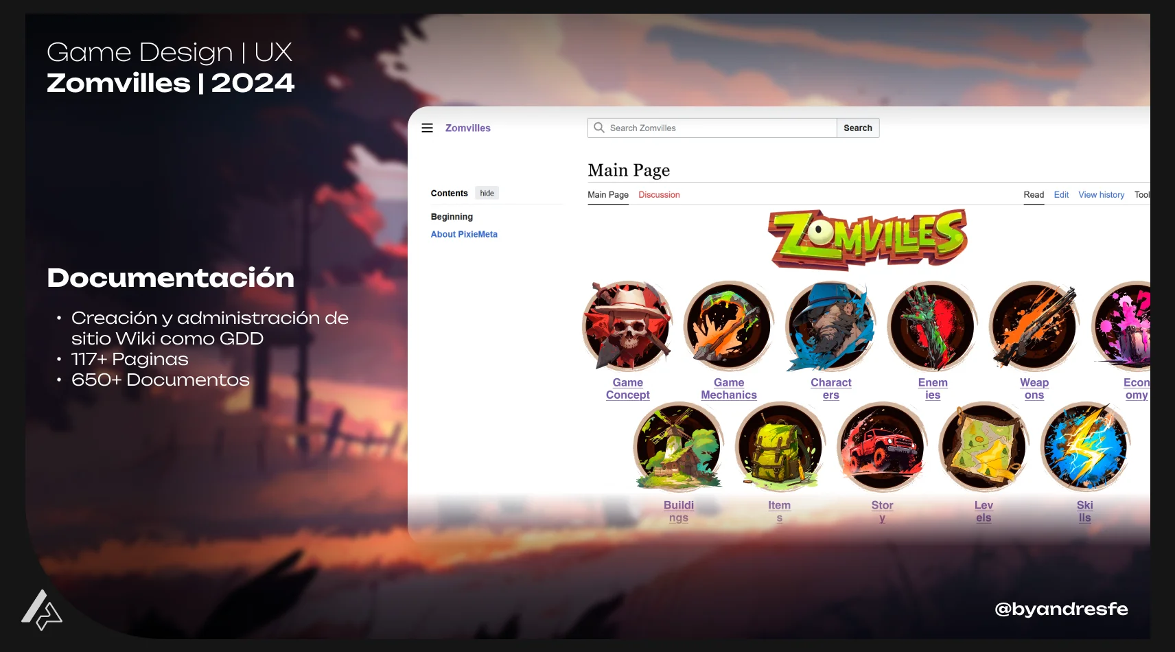
Documentation was one of the strongest parts of the project. The Wiki/GDD grew into a large product knowledge base with more than 117 subsites and more than 650 documents. This helped the team keep track of mechanics, features, balance decisions, UX flows, narrative elements, missions and stakeholder-facing materials.
5. Communicating the product vision
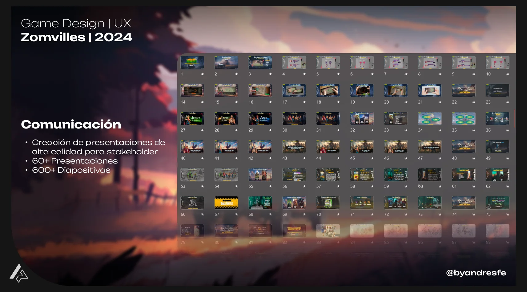
The project required frequent communication with stakeholders. More than 60 presentations and 600 slides were created to explain features, direction, progress and decisions. The goal was not just to document work, but to make the product understandable for everyone involved.
Key decisions
These are the design choices that shaped the most important UX outcomes of the project.
A roguelite can quickly become a collection of systems: skills, enemies, rewards, upgrades, bosses, inventory and progression. Without a clear loop as the anchor, features multiply and the player has no center to return to.
Made the core loop the first design priority before adding more systems. The sequence needed to work first: start a run, survive, choose upgrades, grow stronger, face harder enemies, collect rewards and return with a sense of progress.
Every new feature needed to be evaluated against the loop. If it supported that rhythm, it belonged. If it added complexity without supporting the rhythm, it waited. That filter helped the team decide faster and kept the prototype focused.
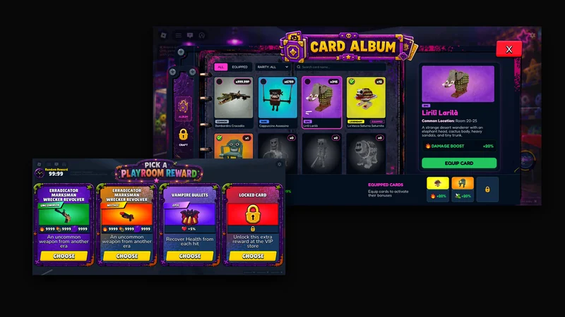
Random card choices are central to this type of game, but they can slow players down if the information is hard to compare quickly on mobile.
The UX direction focused on helping players understand upgrade options fast: what the card does, why it matters and how it changes the run.
Decision-making should be part of the rhythm, not an interruption. In a fast-paced mobile game, every second of confusion pulls the player out of flow. The card system needed to feel like a power moment, not a reading exercise.
With a team of nine and many moving systems, there was a real risk of different disciplines working from different assumptions about how features connected.
Treated documentation as product infrastructure rather than administrative output. The Wiki, flows, wireframes and presentations became shared references that helped every discipline stay oriented.
A prototype with many moving parts is harder to align through conversation alone. Written structure reduces the cost of keeping everyone on the same page, especially when the product is still being defined.
Game design decisions and UX decisions were sometimes being made independently, creating features that worked on paper but created friction when players tried to use them on a small screen.
Connected Game Design and UX work deliberately throughout the process, treating player-facing clarity as part of the design brief rather than a separate pass at the end.
A mechanic only works when the player can understand it, act on it and feel why it matters. In mobile, that connection has to be built in from the start, not added after the system is already defined.
Featured systems
Core Loop and Progression
The core loop was the foundation of the product. Players needed a reason to start another run, try a different character, choose new upgrades and keep improving. The loop connected combat, random upgrades, character selection, inventory, rewards, skill growth, boss challenges and long-term progression. Designing that structure required more than listing features. It required deciding what each element contributed to the player's motivation to return. This area shows the product side of the work: how the game was structured to create repetition with purpose, not just repeated action.
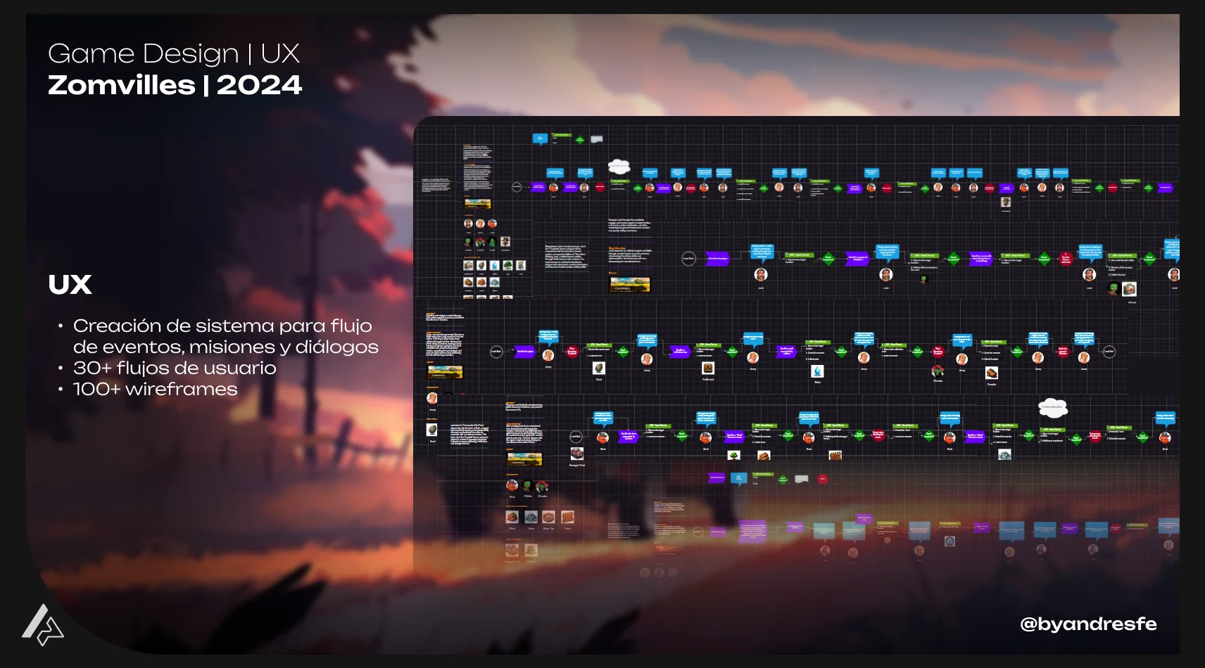
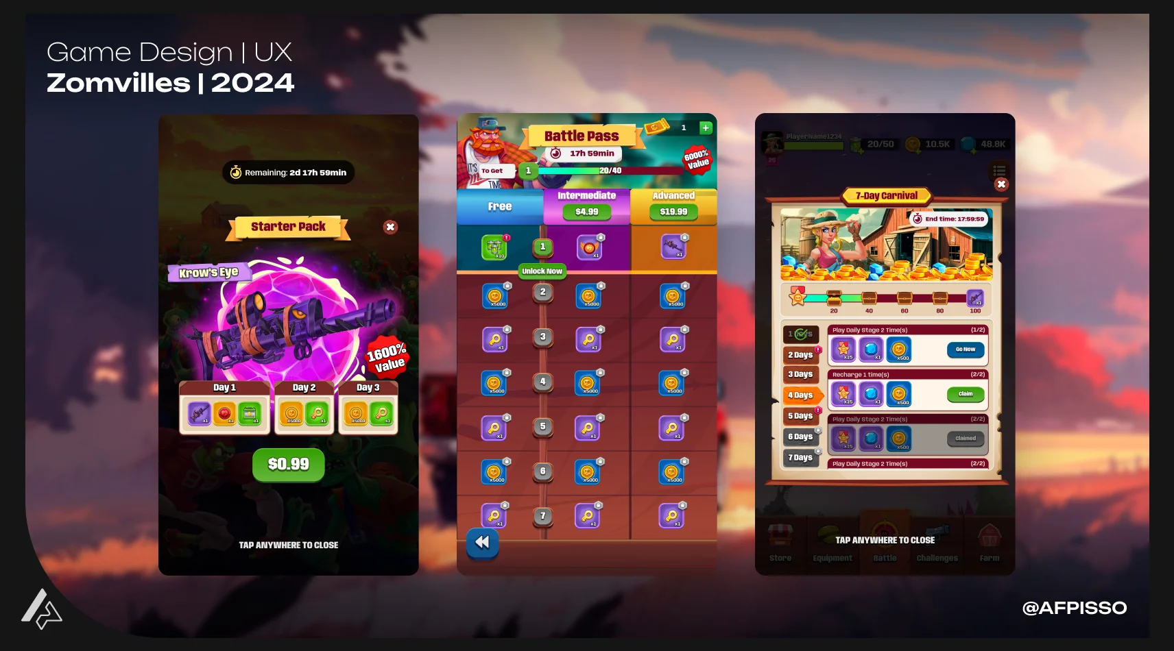
Progression screens helped turn system logic into readable player decisions.
Skill System and Combat Balance
The skill system needed to make each run feel different while keeping combat readable and fair. This required designing skills, upgrade logic, enemy pressure, bosses and balance rules for a hybrid-casual mobile audience. Random card choices are central to this type of game, but they can create friction if the information is hard to compare quickly. The UX direction focused on making upgrade decisions fast to read: what the option does, why it matters and how it changes the current run. This area shows systems thinking: how individual mechanics connect with player decisions, difficulty, pacing and replay value.
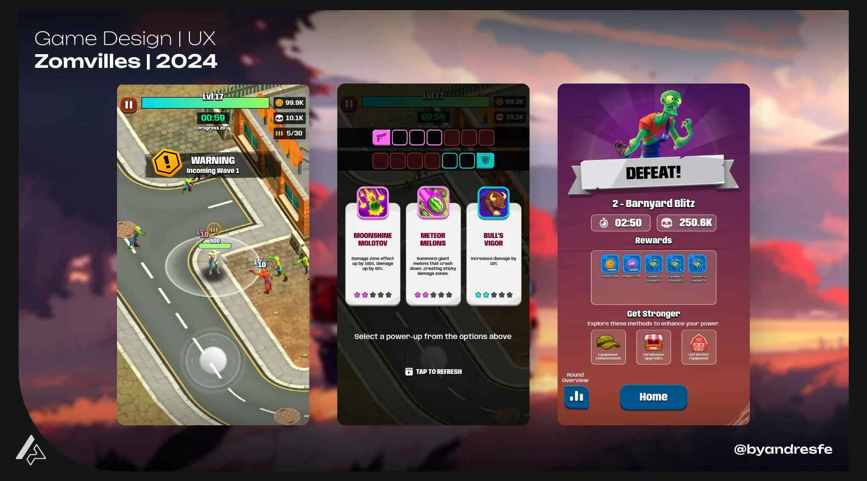
Random cards needed to be fast to compare and easy to understand during the run.
Documentation, UX Flows and Team Alignment
The project generated a large documentation system: more than 117 Wiki/GDD subsites, more than 650 documents, more than 30 user flows, more than 100 wireframes, more than 60 stakeholder presentations and more than 600 slides. The point is not the volume. The point is that the product needed structure. Documentation helped align a team of nine people around systems, flows, mechanics, screens and stakeholder decisions. It became the infrastructure that made the prototype understandable, buildable and easier to discuss. This area shows how I work with complexity: by turning scattered product ideas into shared references the team can use.
UX flows helped translate systems into concrete player-facing interactions.
Deliverables
- Core loop design and documentation
- Progression system architecture
- Skill system design and balance foundations
- Character selection, inventory, HUD and progression screen design
- Random card system UX design
- More than 30 user flows
- More than 100 wireframes
- Wiki/GDD with more than 117 subsites and more than 650 documents
- More than 60 stakeholder presentations and 600 slides
- Narrative systems, missions, events, dialogue and localization support
Outcome
The prototype reached a state where nine people were aligned on what they were building, why each system existed, and how the player experience was supposed to feel. That does not happen by accident on a multi-system project with a short runway. The main output was structural: a working core loop, defined progression systems, 30+ UX flows, 100+ wireframes, and a documentation system with 117+ Wiki subsites the team could work from without constant alignment meetings. Launch was paused before live data. The foundation was real.
Impact / Evidence
117+ Wiki/GDD subsites and 650+ documents kept a 9-person team aligned across systems, mechanics, flows, narrative, and stakeholder decisions throughout the prototype phase — reducing the back-and-forth cost of a multi-system build
30+ UX flows and 100+ wireframes translated abstract systems into concrete player-facing interactions, making character selection, upgrade decisions, combat logic, and progression readable before screens were finalized
Defined the full product structure: core loop, skill system, progression, combat balance, inventory, economy, and narrative systems. That structure gave the team a shared vocabulary and a priority filter — if a feature did not serve the loop, it waited
60+ stakeholder presentations and 600+ slides turned a complex multi-system prototype into a communicable product vision, enabling faster alignment and clearer iteration decisions at each production stage
Internal playtests and a deliberate design-to-dev flow identified friction in the core loop and card choice system early — allowing structural corrections before scope expanded further
No live performance data: launch was paused before public release. Evidence is structural — the prototype reached a playable, team-aligned state with all primary systems defined, documented, and playtested internally.
Implementation & Handoff
The documentation system was the handoff. The Wiki/GDD with 117+ subsites and 650+ documents served as a persistent design record for design, development, art, and stakeholders. Individual feature documents included design intent, system rules, edge cases, UX flows, and implementation notes. The 30+ user flows and 100+ wireframes provided the visual and structural specification for every major player-facing interaction. Stakeholder presentations — 60+ decks, 600+ slides — kept the product direction legible at every phase of the prototype. The goal was not volume. The goal was that any team member could open a document and understand what was being built, why, and how.
Research & Validation
Research drew heavily from the genre leaders: Survivor.io and Vampire Survivors were the primary references for core loop structure, upgrade pacing, and player feedback rhythm. I studied how competing titles handled the tension between mechanical depth and mobile session length, random upgrade readability, and progression clarity for hybrid-casual audiences. Internal playtests ran throughout the prototype phase and fed directly into structural adjustments to the core loop, upgrade card UX, and progression screen hierarchy. Playtest findings shaped the wireframe priorities and informed which system complexity was player-readable versus designer-only logic.
Research, Playtests and Feedback
The project included internal playtests and feedback sessions throughout the prototype phase. Those sessions helped identify where the core loop was unclear, where upgrade decisions created confusion and where progression felt disconnected from player effort. Some systems were simplified or restructured based on what playtesters encountered. Not everything could be fully resolved before the launch was paused, but those findings shaped the documentation and informed the priorities for continued work.
What I learned
The biggest risk in a multi-system project is not a lack of ideas. It is unclear priority. When you do not have a filter, features multiply, team energy splits, and the prototype becomes something nobody can fully describe. Making the core loop the first design priority — and evaluating everything else against it — was what kept this project moving. If a system did not support the loop's rhythm, it waited. That filter helped the team decide faster and kept the scope honest. Game Design and UX are the same job on mobile. A mechanic only works if the player can understand it, act on it, and feel why it matters in under two seconds. That connection has to be built in from the start, not added after the system already exists.
This case shows how I approach product work at the system level — not individual mechanics or screens, but the structure that makes everything connect and a team understand what it is building. Documentation here was not a deliverable at the end of the project. It was how the work moved forward. 117+ Wiki subsites, 650+ documents, 60+ stakeholder presentations — that is not volume for its own sake. It is what it takes to keep a nine-person team building from the same vision over twelve months.
If my work fits your team or project, reaching out should take less than a minute.