Executive summary
Designing an award-winning educational web game where learning and play feel like the same thing.
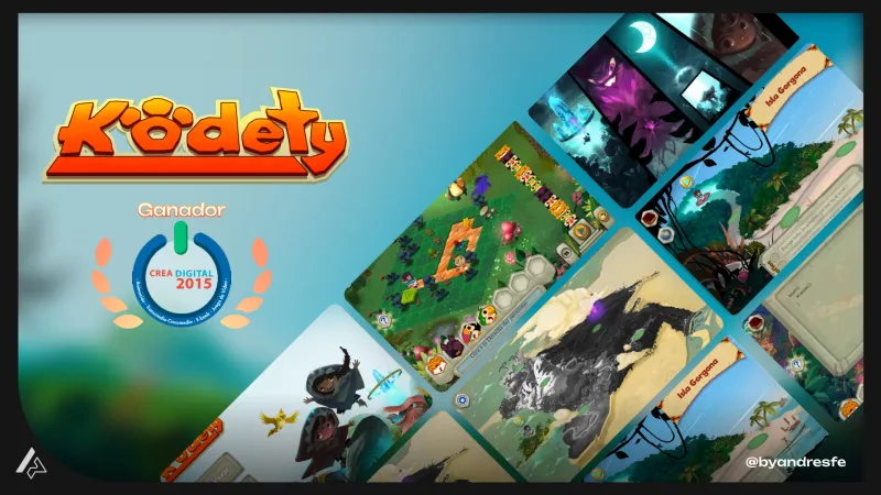
Kodety is an educational web game developed at the Universidad Cooperativa de Colombia. It won an industry award. My work covered game design and UX/UI: mechanics, feedback systems, interaction flows, and visual interface. The central design challenge was making the learning content part of the experience — embedded in the challenge structure, not explained before it. When players encounter educational material as instructions, they skip it. When it lives inside the game, they engage with it.
Context
Educational games carry a design tension that most entertainment games do not: the learning objective and the play objective have to feel like the same thing. If a player perceives the educational content as separate from the fun — something to get through before the game starts — engagement collapses fast. For a web game, the drop-off risk is even higher. No installation means no commitment. Players make entry and exit decisions within seconds.
The challenge
The mechanics had to teach without feeling like lessons. The interaction needed to create genuine challenge and reward while the educational content lived naturally inside the loop — not as a gate the player had to pass through. Web constraints added a second layer: no installation, fast load times, cross-browser compatibility, and a UI that worked for users with no gaming background. Nothing could require extended reading to understand.
My role
I worked on game mechanics design, UX flows, and UI design. My focus was on how players interacted with the learning content through the game: the feedback systems, progression indicators, and interface clarity that made the educational loop feel like play rather than instruction.
Constraints
- Web platform: browser-based interaction model, no native game engine
- Educational content requirements: mechanics had to align with learning objectives
- Short session tolerance: web users are more likely to drop off than dedicated game players
- Broad age range in target audience: UI had to be clear without prior game literacy assumptions
- Fast load requirement: no heavy assets or long initialization
UX approach
Mechanics as learning vehicles
Designed game mechanics where the correct action to progress was also the action that reinforced the learning objective. The player was not being tested; they were practicing. The distinction matters for engagement: testing feels like evaluation, practice feels like play.
Feedback as the teacher
Designed the feedback system to do the instructional work. Rather than explaining rules upfront, the interface responded to player actions in ways that made the correct approach discoverable. Wrong paths had clear visual consequence; correct paths had immediate reward.
Interface clarity for a broad audience
Designed the visual interface to be legible for users with varying levels of game literacy. Interaction affordances were explicit, state changes were clear, and nothing required reading extended text to understand.
Session design for web
Structured the experience so each session had a complete arc: a challenge, an attempt, a result, and a sense of progression. Web users make quick entry and exit decisions. Each visit needed to feel worthwhile in under three minutes.
Key decisions
These are the design choices that shaped the most important UX outcomes of the project.
Early prototypes showed players reading the educational content as instructions rather than engaging with it as part of the game, and then skipping it.
Redesigned the content integration so the educational material was embedded in the challenge structure rather than presented before it. Players encountered the content through play, not through a pre-game explanation.
Instructions that appear before the game are a cognitive cost. Players skip them and then fail, or read them and forget. Content that appears in context is encountered when the player has a reason to care about it.
Feedback timing was rewarding correct answers too slowly, which reduced the sense of responsiveness and made the game feel unengaging.
Moved reward feedback to immediate visual confirmation on correct interaction, with the reinforcing educational element surfacing in a secondary beat.
Fast feedback loops are fundamental to game engagement. The reward has to feel immediate. Secondary information can follow once the player has felt the win.
Deliverables
- Game mechanics design documentation
- UX flow wireframes and interaction specs
- Visual interface design for all game states
- Feedback system design and state definitions
- Design handoff documentation for development
Outcome
Kodety shipped on web and received an industry award. The recognition was specifically for the design approach — which, to me, validates the core decision: embedding the learning inside the challenge structure rather than presenting it as a prerequisite. When learning and play objectives are aligned at the mechanics level, players engage with both at the same time without noticing the distinction.
What I would check next
Educational game design benefits from learning outcome measurement alongside engagement data. I would want to run assessments comparing what players know before and after sessions, correlated with where they engaged longest in the game. That data would tell us which mechanics are doing the educational work most effectively.
The most interesting design problems are the ones where the product has a goal and the user has a different goal — and your job is making them feel like the same goal. Educational games are an extreme version of that. But the principle shows up everywhere: onboarding flows that teach through doing, products that want users to build a habit, dashboards that guide behavior without directing it. In all of those cases, the UX job is the same: make the product's intended outcome feel like the user's own intention.
If my work fits your team or project, reaching out should take less than a minute.