Executive summary
Making roguelike run clarity and Star Wars IP fidelity work as a single design problem.
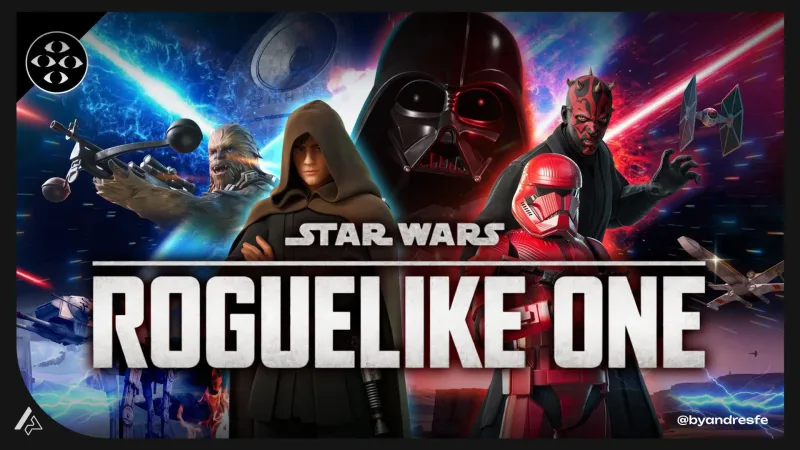
Star Wars: Roguelike One is a live UEFN experience that brings players into the Star Wars universe as a roguelike. The challenge is not just making it play well — it is making the interface feel like it was designed for this universe, not adapted from a generic template. My work covered run state visibility, combat feedback, progression communication, and the post-run screen. Everything went through two filters: does this communicate what the player needs, and does this feel like Star Wars.
Project Snapshot
Role
Game UX/UI Designer
Context
Live UEFN experience inside Fortnite, licensed IP
Platform
Fortnite / UEFN
Team
Cross-functional: design, art, engineering
Tools
Figma · UEFN · Jira · Confluence
Main Challenge
Build roguelike readability inside a live UEFN experience while maintaining Star Wars IP tone across all interface decisions.
Key Deliverables
Run state UI system, IP feedback language guide, combat feedback specs, post-run flow, UEFN implementation notes
Status
Shipped (live)
Constraints
Star Wars IP requirements · UEFN UI limits · Fortnite native HUD · Fortnite-native player expectations
My Ownership
I owned the UX/UI systems for run orientation, combat feedback, progression communication and the post-run flow. I worked within UEFN constraints and collaborated with design and art on implementation feasibility and IP alignment. My responsibility was making the roguelike loop legible and the Star Wars tone consistent — not as separate goals, but as a single design problem.
Context
Star Wars is one of the most tonally consistent universes in entertainment. Decades of films, games, and media have built player expectations about how this universe looks, sounds, and communicates. An interface that ignores those expectations does not just look wrong — it reminds the player they are in a Fortnite mini-game. On top of that, UEFN: limited custom UI, Fortnite's native HUD always in the frame, a player base that reads information fast and skips everything else.
The challenge
Roguelike clarity requires fast, predictable feedback: current state, current risk, outcome of action. The IP requirement adds a second rule on top of that: every feedback element has to feel native to Star Wars, not borrowed from generic game UI. Generic HUD elements communicate clearly. They also break the fantasy instantly. Too much custom UI breaks UEFN constraints. The problem was finding the overlap — feedback that is readable AND that reads as part of the universe.
My role
I designed UX/UI systems for run orientation, combat feedback, progression communication, and the post-run flow. I worked within UEFN constraints and collaborated with the design and art teams to align implementation with IP fidelity requirements.
Constraints
- Star Wars IP requirements: interface had to be visually consistent with established franchise language
- UEFN limitations on custom UI placement and rendering
- Fortnite native HUD occupies core screen zones and cannot be removed
- Roguelike run structure requires persistent state communication without cognitive overload
- Player base is Fortnite-native: expects fast reads, not deep onboarding
UX approach
IP-faithful feedback language
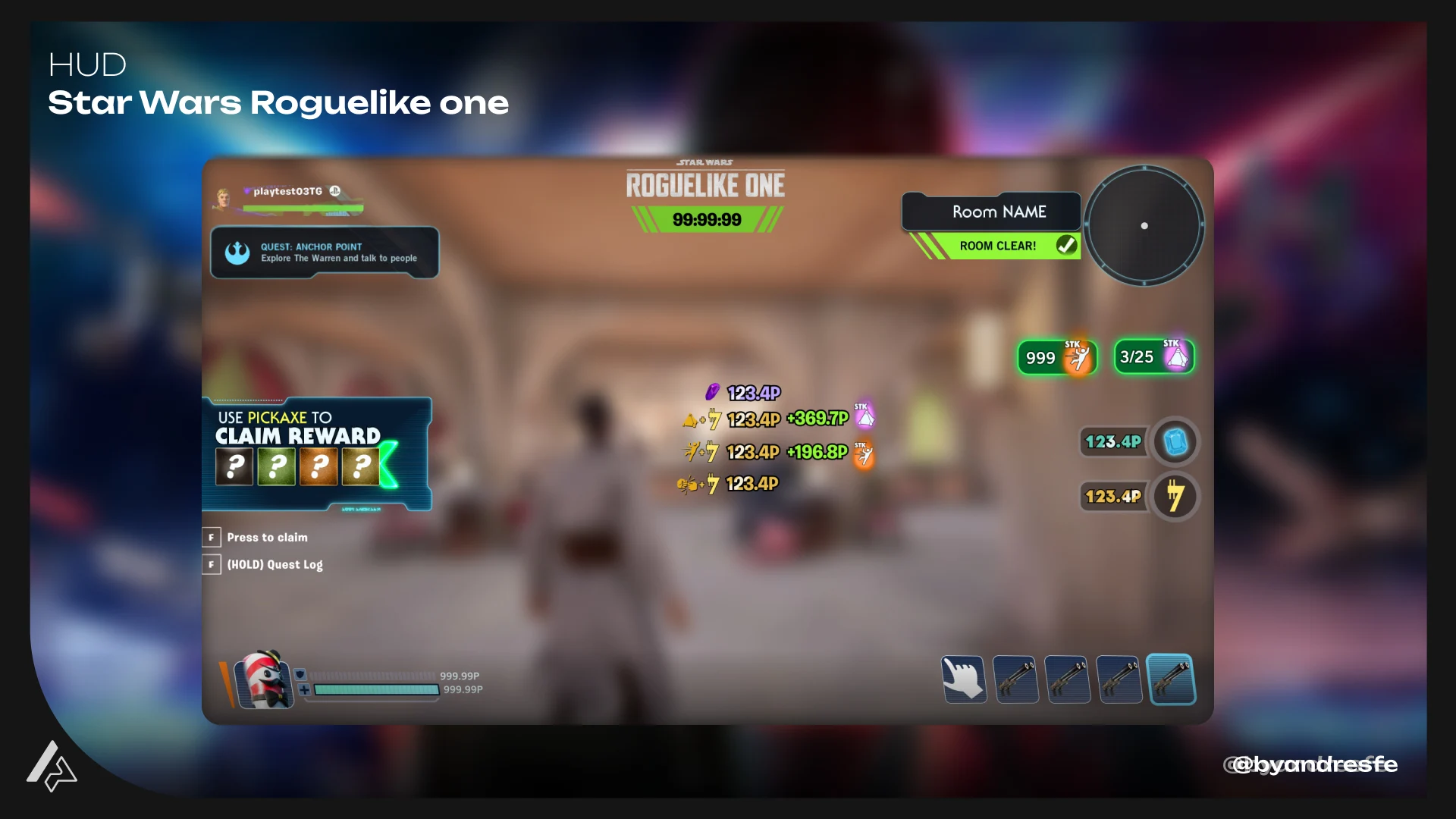
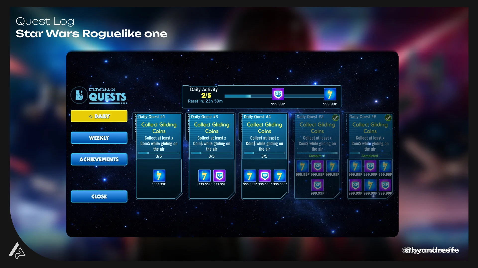
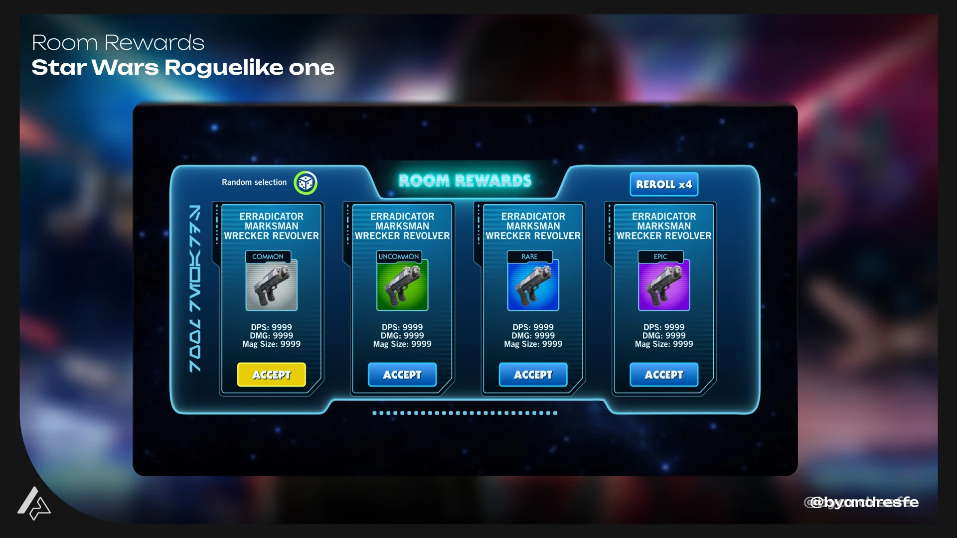
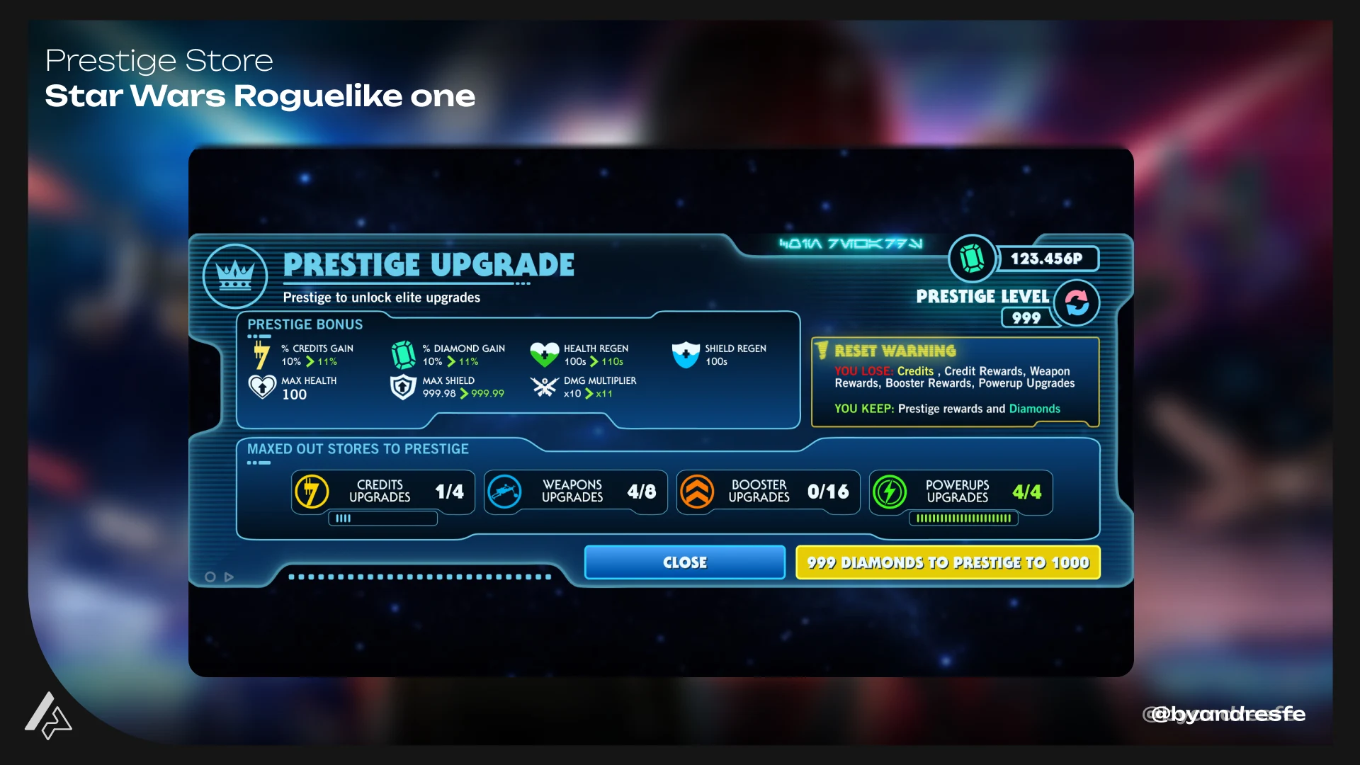
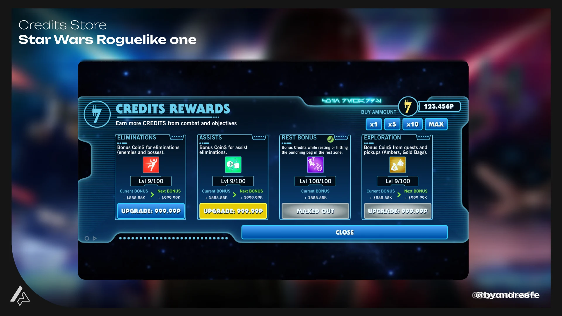
Established a visual vocabulary grounded in Star Wars iconography rather than generic game UI. Feedback signals drew from established franchise cues — color temperature, typography weight, and motion patterns consistent with how the universe has communicated information in other media. Players could read state without needing to learn a new system from scratch.
Run state at a glance
Designed a persistent run status layer that communicated the three most critical variables without dominating the screen: objective progress, available resources, and current threat level. Information outside those three was accessible on demand. This reduced cognitive load while keeping players oriented across fast combat sequences.
Combat feedback within UEFN constraints
Worked within UEFN device system constraints to design feedback that felt responsive and IP-appropriate. Focused on timing, position, and visual intensity rather than complex animations that would exceed platform limits. The result was feedback that reads clearly without requiring custom solutions that UEFN cannot support reliably.
Post-run momentum design
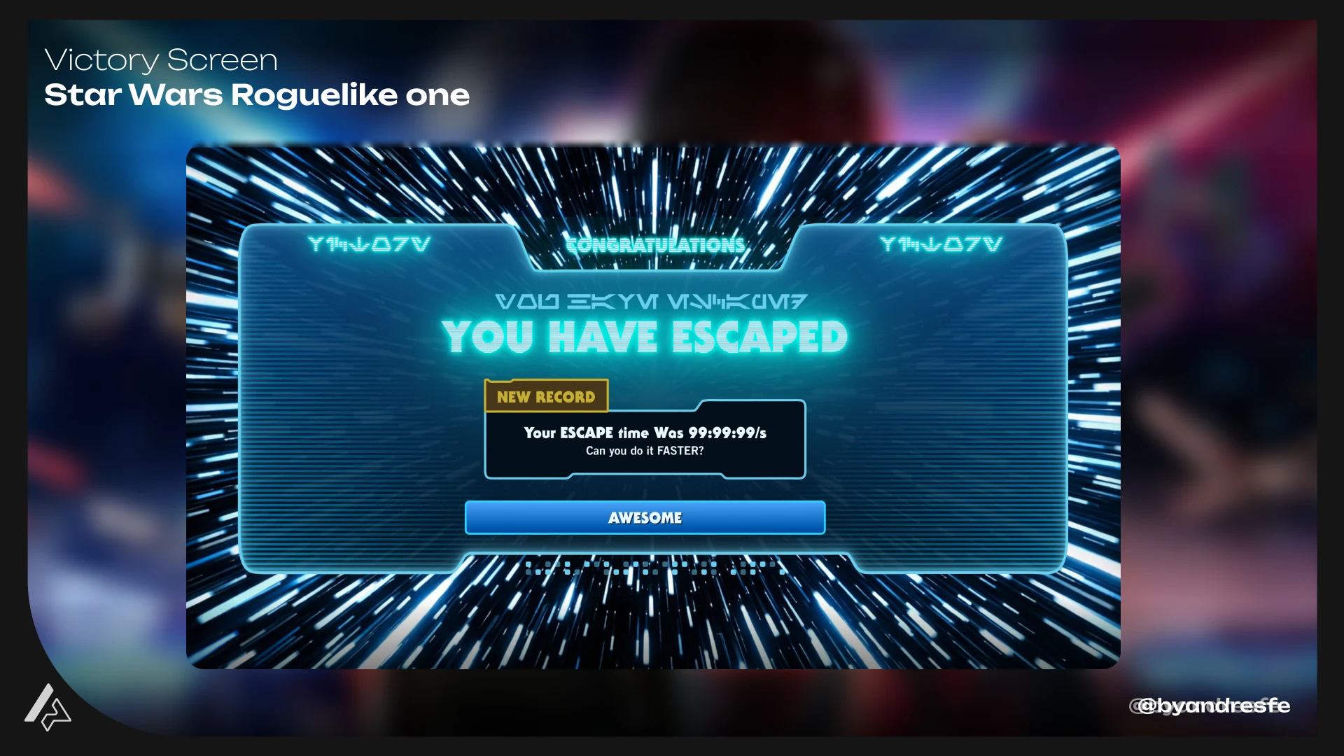
Designed the end-of-run screen to make progression tangible and re-entry easy. The flow revealed results, unlocks, and next objective in sequence rather than all at once — giving players a moment with each beat before moving to the next. Roguelike retention depends on the player feeling forward momentum between runs.
Key decisions
These are the design choices that shaped the most important UX outcomes of the project.
Early prototypes used generic UEFN UI components that communicated game state clearly but read as completely disconnected from the Star Wars universe, weakening IP immersion on every interaction.
Replaced generic UI treatments with solutions grounded in Star Wars visual language — color assignments, typographic hierarchy, and motion timing calibrated to franchise precedent rather than game UI defaults.
IP experiences live or die by tone consistency. A player inside Star Wars who sees a generic health bar is reminded they are playing a Fortnite mini-game. A player who sees interface language that feels native to the universe stays in the experience. The UX job is to make the seams invisible.
Run-end was causing drop-off: players were seeing the results screen and leaving before re-entering, which broke the roguelike retention loop.
Redesigned the post-run flow to lead with progress made rather than run result, and to surface the next unlock or objective immediately after. Changed the primary action from "return to lobby" to "run again" with the reward state visible.
Roguelike retention is an emotional loop, not a data presentation. Players re-enter when they feel forward momentum, not when they understand their score. The screen needed to answer "what changes if I play again" before it answered anything else.
Deliverables
- Run state UI system and component states documentation
- IP feedback language guide and application examples
- Combat feedback timing specifications
- Post-run flow and information architecture
- UEFN implementation notes and screen zone maps
Outcome
Star Wars: Roguelike One shipped in 2026 and is currently live inside Fortnite. The post-run flow redesign — leading with progress made rather than run result, and surfacing the next unlock immediately — addressed observable drop-off behavior at the results screen. Combat feedback and run state used IP-grounded visual language instead of UEFN defaults. Specific engagement metrics are not yet available publicly.
Impact / Evidence
Designed player-facing UX around fast combat readability and roguelike decision-making within UEFN technical constraints.
Helped players understand run state, combat feedback and progression without breaking Star Wars immersion — using IP-grounded visual language instead of generic game UI.
Defined interface patterns grounded in franchise precedent that could support consistent communication across different run states, feedback moments and progression beats.
Documented IP feedback language, component states and UEFN implementation notes to support alignment between design intent and what engineering could deliver on platform.
Combat feedback and post-run flow were designed to work within UEFN device system constraints — timing, position and intensity calibrated to what the platform could support reliably.
Public engagement metrics are not available to share. This case emphasizes UX structure, production constraints, IP alignment and player clarity decisions across a live shipped experience.
Implementation & Handoff
Handoff included run state UI documentation, IP feedback language specifications, combat feedback timing notes and UEFN screen zone maps. Because UEFN has real constraints on what custom UI can do reliably, implementation notes were built into the design specs rather than separated as an afterthought. Each decision was cross-checked against what the platform could actually support.
Research & Validation
This work was informed by player clarity goals, IP fidelity requirements and UEFN platform constraints. The interface decisions were validated through design review and IP alignment checks. The post-run flow redesign was driven by observed behavior patterns: players were dropping off at the results screen, indicating the re-entry hook was not working as designed. Addressing that required rethinking what the screen led with, not just how it looked.
What I would check next
I would track the drop-off rate at the post-run screen and compare it to run-again rate across first-session and returning players. That delta tells you whether the re-entry hook is working or whether players are extracting a single session of value and leaving. I would also look at moments where players die without appearing to understand why — those are the places where the combat feedback system still has work to do.
IP fidelity and UX clarity are not competing constraints — they are the same problem approached from two directions. When they are treated as one, the solution gets better at both. A player inside Star Wars who sees a generic health bar is reminded they are playing a Fortnite mini-game. A player who sees interface language that feels native to the universe stays in the experience. Making those seams invisible — that is the UX work. The same challenge shows up in any licensed product or tightly governed design system: the answer is always in the overlap between what the brand demands and what the user needs.
If my work fits your team or project, reaching out should take less than a minute.