Executive summary
Building the UX architecture for a D&D roguelike inside Fortnite — from first-time player flow to production handoff.
D&D Zombie Dragon Adventure is a live roguelike experience inside Fortnite. Class selection, shared lobby, stores, D20 events, missions, upgrades, and a Dracolich boss at the end. On paper, it sounds like a lot. For a new player, it could easily feel like too much. I led a team of three over a four-month production window. We defined the FTUX, built the Adventure Book menu system, documented the store flows, and shipped implementation-ready deliverables within UEFN's real technical constraints — including the ones that were not obvious until we hit them.
Project Snapshot
Role
UX Lead
Context
Active UEFN production inside the Fortnite ecosystem
Platform
Fortnite / UEFN
Team
UX/UI team of 3
Tools
Figma · UEFN · Jira · Confluence · Adobe Suite
Main Challenge
Complex roguelike system with no shared UX architecture. Players needed to understand class selection, stores, upgrades, D20 events, missions and progression — all without slowing down the Fortnite rhythm.
Key Deliverables
FTUX flow, Adventure Book screen system, store flows, UI assets, WBP references, naming conventions, export guidelines, accessibility and heuristic documentation
Status
Shipped (active)
Constraints
UEFN platform limits on UI responsiveness, fonts and widget behavior · short production window · high scope · recognizable IP visual requirements
My Ownership
I owned the UX process, player flows, information architecture, documentation strategy and design-system decisions for this experience. I led a team of three designers, defined the structure for the FTUX, Adventure Book, stores and upgrade systems, and was responsible for producing implementation-ready deliverables. My role included defining what needed to be designed, how it needed to be documented, and how the work should be handed off — not just executing individual screens.
Context
UEFN is not a blank canvas. You get a fixed Fortnite HUD, limited widget behavior, constrained font options, and a player base that arrived to play Fortnite — not to learn a new game. Any complex system you design has to work inside those limits, or it does not ship as designed. Add a recognizable D&D IP with visual expectations, a four-month window, and multiple implementation dependencies across teams. That was the starting condition for everything we built.
The challenge
The experience had eleven interconnected systems. A player needed to understand the roguelike loop, how to improve between runs, what D20 events do, and how class selection shapes the experience — ideally in their first session, without a tutorial that kills the Fortnite pace. At the same time, the production window was tight. The UX work had to move fast enough to stay ahead of implementation without losing the structure the player experience needed.
Player clarity: helping new players understand the adventure loop, upgrades, D20 events and progression.
Production clarity: documenting flows, assets and requirements for multiple areas.
Technical clarity: designing UI that could work within UEFN limitations, including screen sizing, fonts, textures, Verse and widget constraints.
My role
As UX Lead, I led both the process and the people involved in UX/UI work.
- Leading the UX/UI process for the project
- Coordinating a team of three designers including myself
- Defining flows, priorities and documentation needs
- Creating UI assets such as iconography and store banners
- Designing the Adventure Book screen system
- Supporting copy for UI and player-facing systems
- Creating documentation for features and implementation
- Reviewing accessibility and heuristic issues
- Preparing wireframes, HiFi screens, WBP references and optimized assets for implementation
- Working with design, engineering, art and production to align the experience
Constraints
- UEFN did not provide the same flexibility as a fully custom responsive UI system.
- The interface needed to work across different screen sizes and support split-screen considerations.
- Font options were limited to platform-supported typography.
- Several systems depended on a mix of Verse and widgets.
- Some store functionality could not use widgets in the expected way at the time.
- Textures and assets needed to be optimized carefully to protect performance.
- The project had a recognizable IP, which meant UI decisions needed to respect visual direction and approval needs.
- The production window was short and the scope was high.
Player experience loop
The main loop was roguelike: kill, die, improve and try again. Players started in a shared lobby with personalized progression. From there they could buy upgrades in stores, interact socially and prepare for the next run. Before entering the adventure, players selected one of three classes. During the run they explored routes, fought enemies, completed rooms, opened chests, interacted with D20 events and progressed toward the final boss.
Shared Lobby
Personalized progression space. Players check stats, interact socially and prepare before the next run.
Stores and Upgrades
Buy stat upgrades, improve chest rewards and unlock gameplay options. The camp upgrades build over time.
Class Selection
Before entering the adventure, players pick one of three classes. This shapes the run.
Adventure Entry
Players explore branching routes, fight enemies and complete rooms across the world.
Chests and D20 Events
Rewards and random events add unpredictability. Smart engagement pays off.
Defeat the Dracolich
The final goal: explore every route and take down the boss. Then start again, stronger.
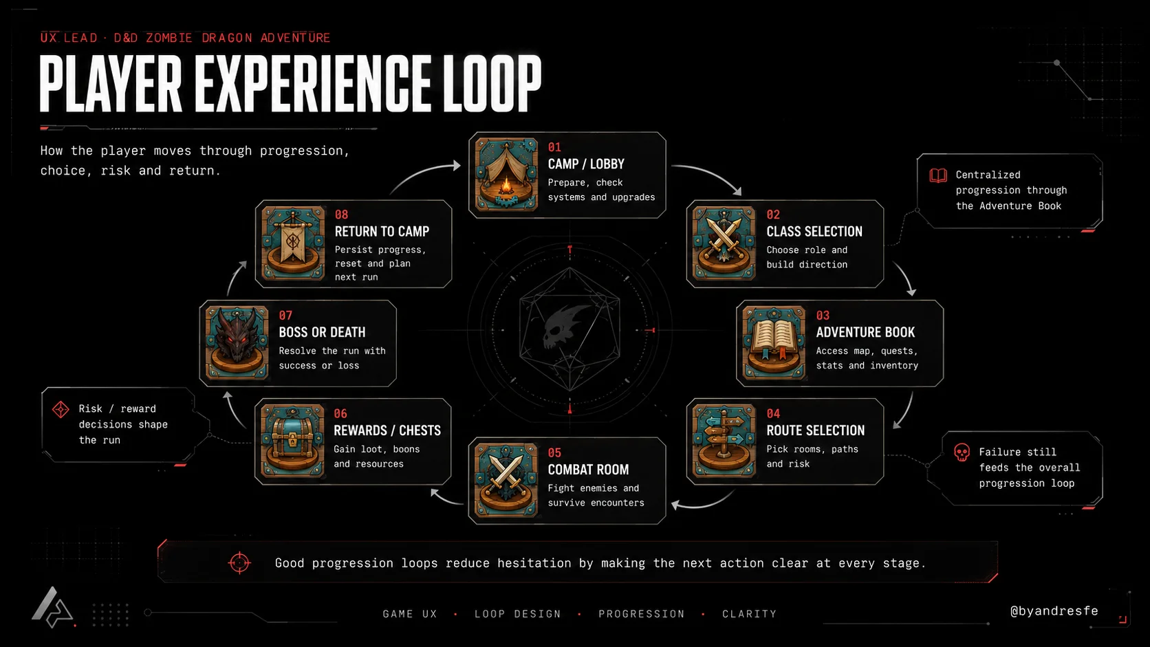
Player experience loop: from lobby to Dracolich. Roguelike structure across sessions.
UX approach
Understanding the loop
The first step was mapping how the player moved through the experience: lobby, class selection, adventure entry, rooms, enemies, rewards, upgrades, missions, D20 events and boss progression. The experience had many systems, so the UX work needed to help players understand the loop without slowing down the Fortnite rhythm.
Structuring the FTUX
The FTUX needed to teach the basic roguelike flow, how to improve stats and how to interact with D20 events in the world. The goal was to make the first experience clear, quick and dynamic enough for the ecosystem. This required defining the base player flow, the order of information and the way each stage should be presented.
Designing the Adventure Menu
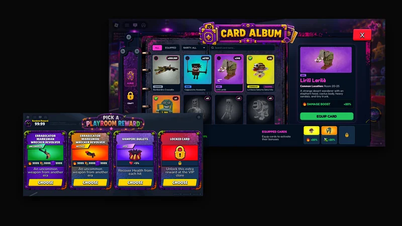
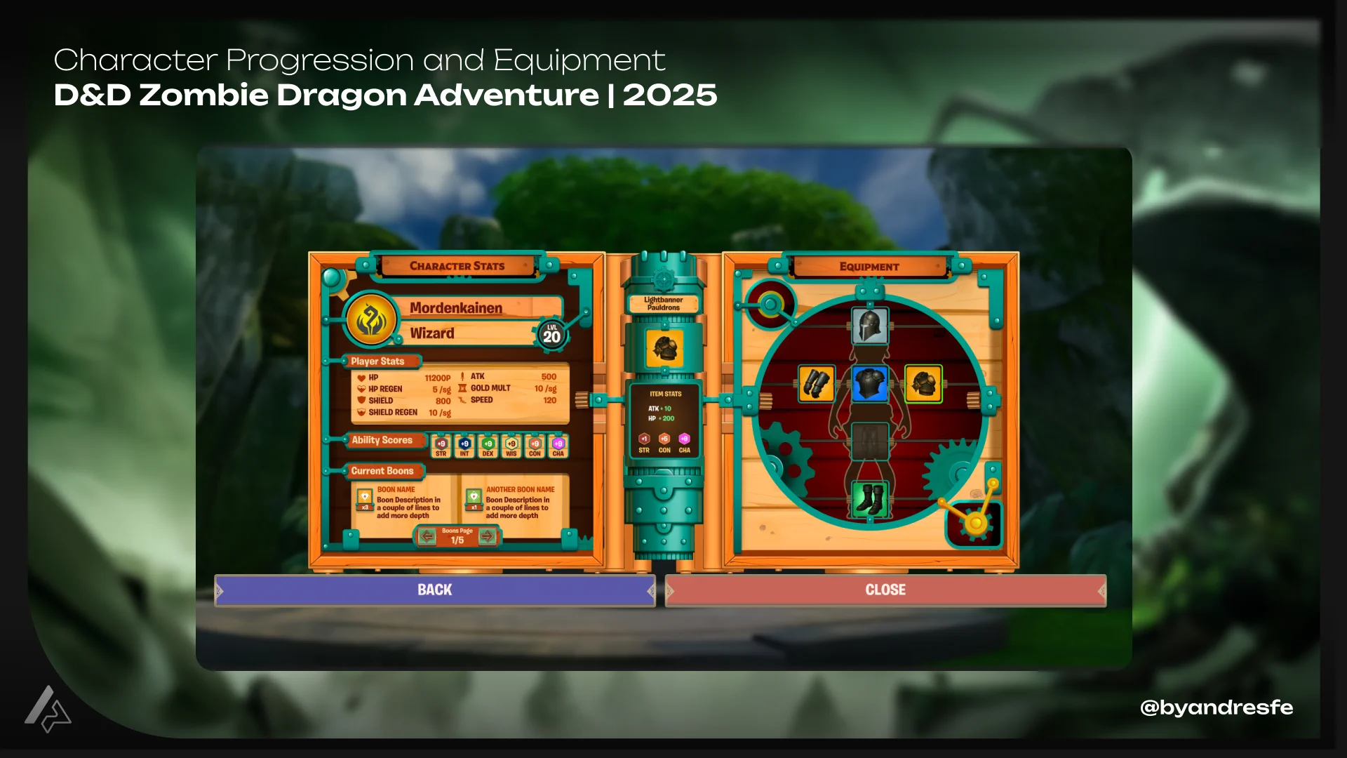
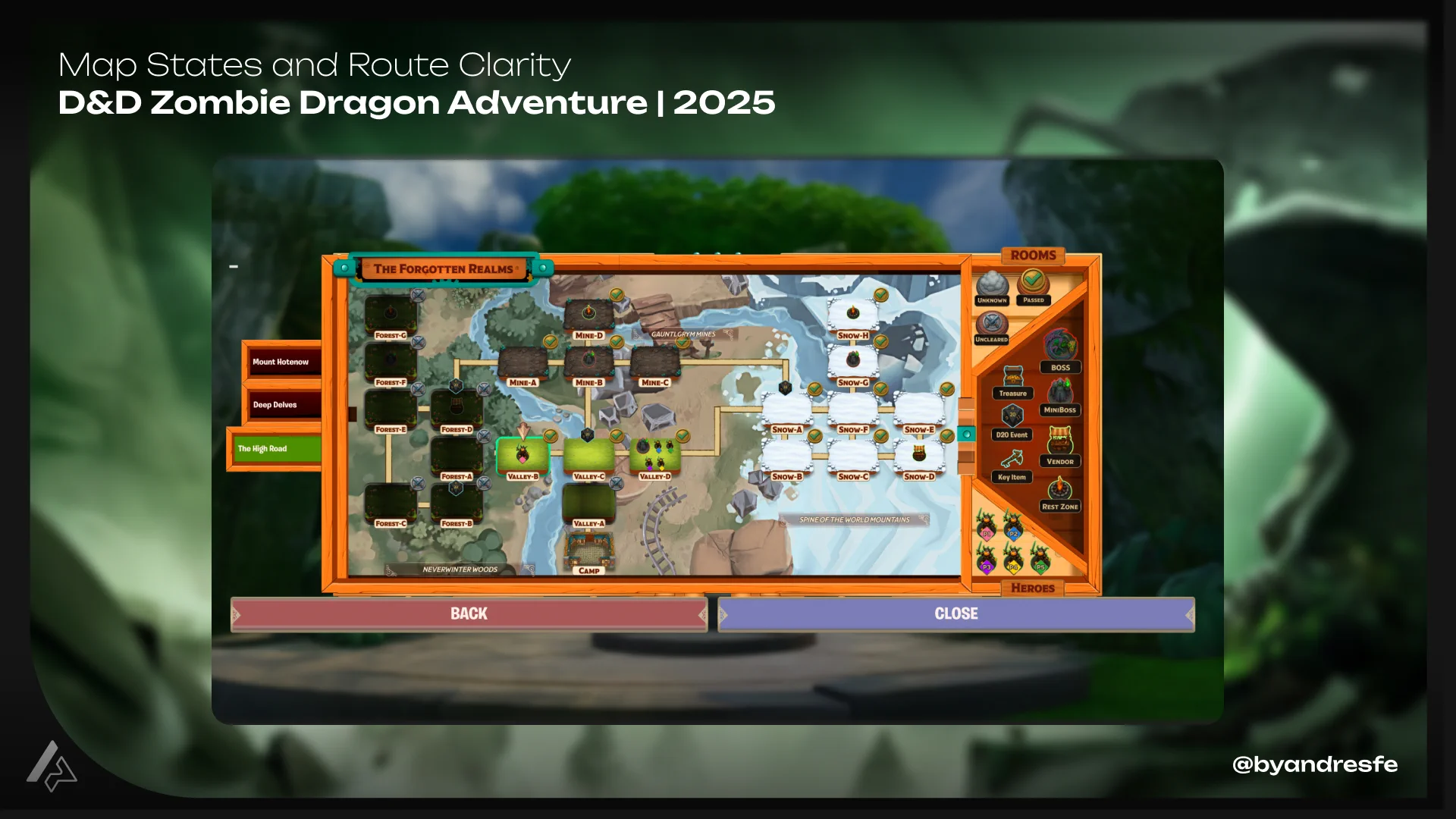
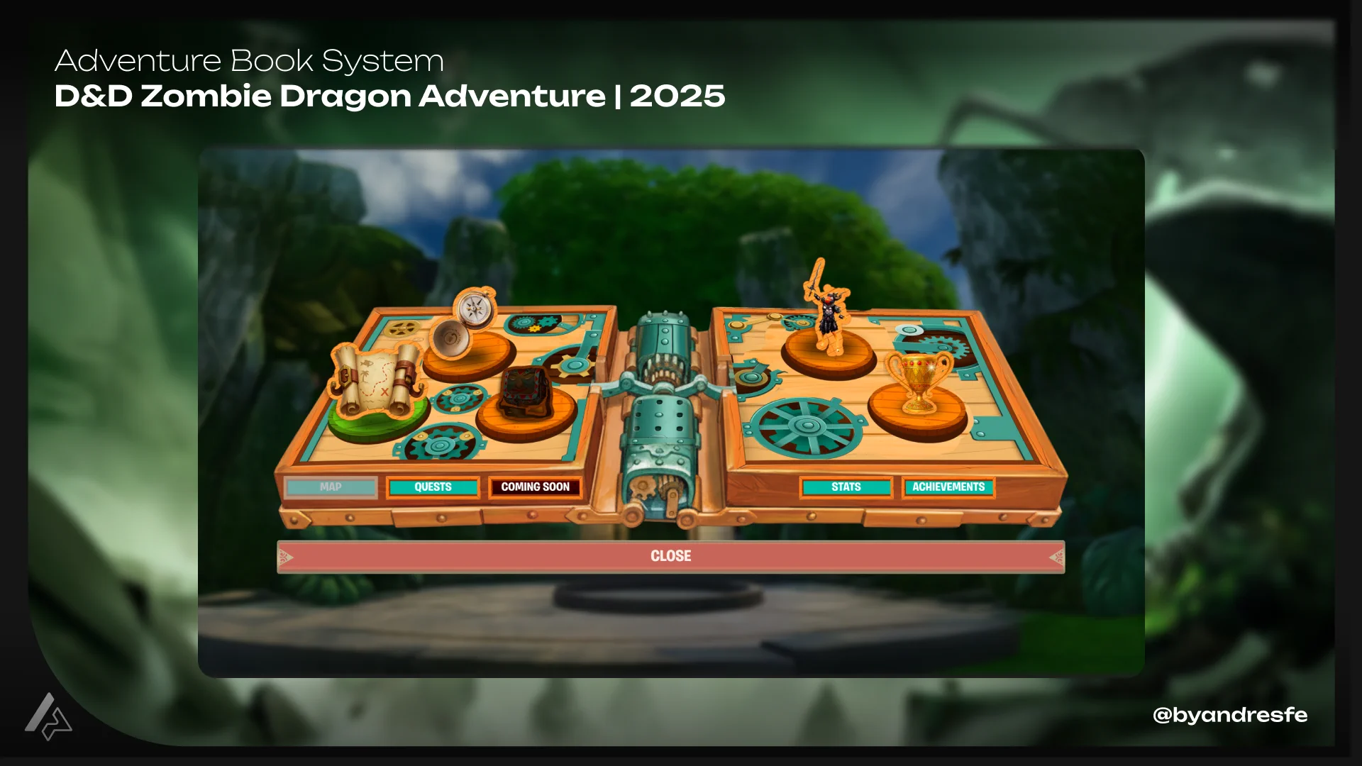
One of the main systems was the Adventure Book, a menu structure where players could consult progression information when needed. It included sections for stats, inventory, missions, achievements and map. Not every section remained visible in the live version due to production timing, but the system helped define the information architecture and UI direction for player progression.
Documenting stores and upgrades
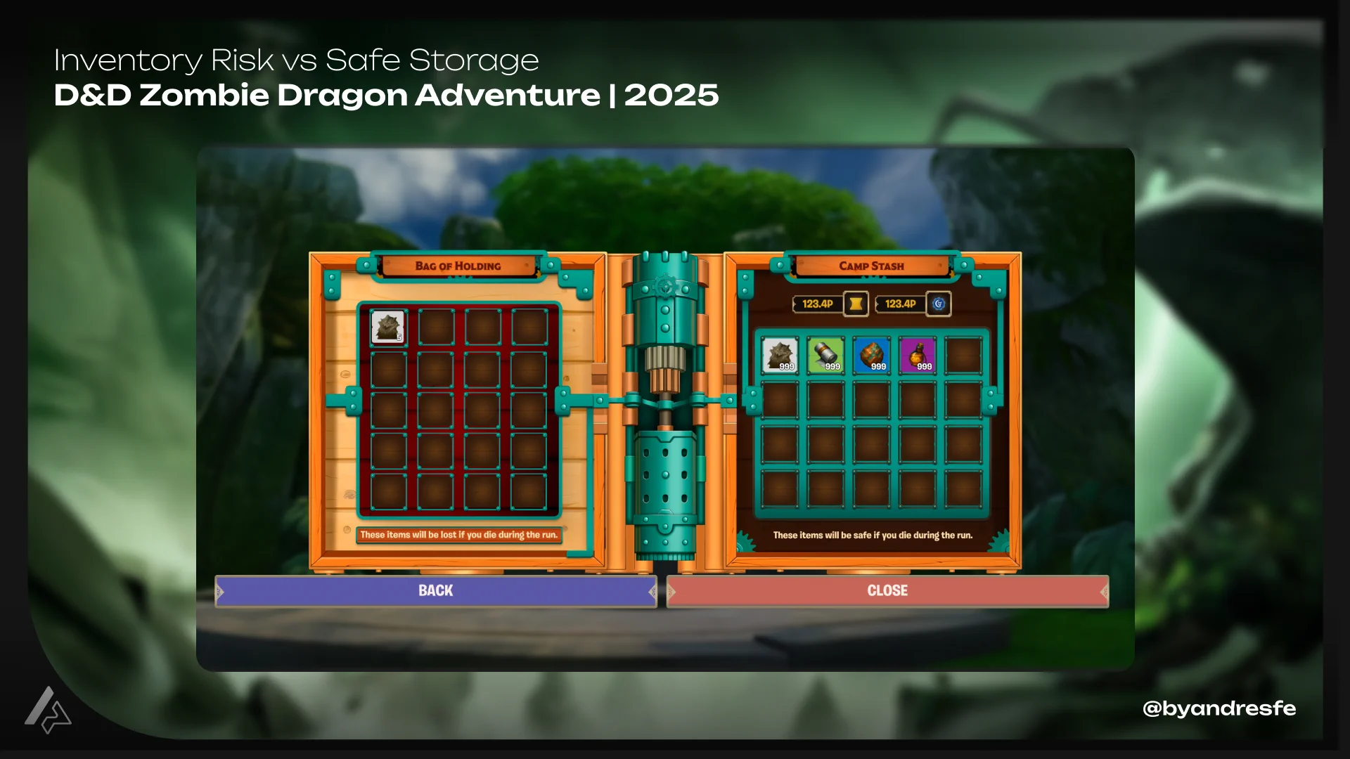
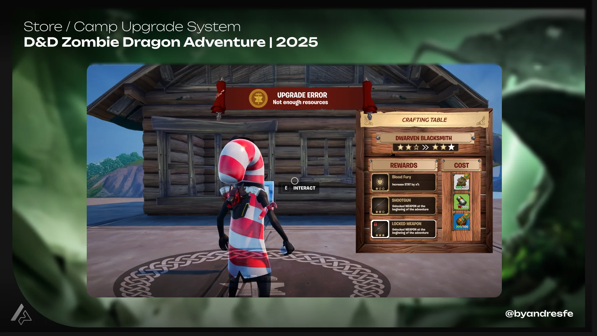
The stores and camp upgrade system needed to support a tycoon-style progression layer. Players could upgrade shops, improve what they obtained from chests, buy attribute upgrades and unlock different gameplay opportunities. The UX work helped document each store flow, define the upgrade logic and support alignment with the art team around the visual identity of the experience.
Preparing implementation-ready deliverables
The work included wireframes, HiFi screens, WBP references, UI assets, naming, export considerations and documentation. Because UEFN implementation had technical restrictions, the design system and handoff had to consider screen sizing, performance, asset optimization and implementation limits from the beginning.
Key decisions
These are the design choices that shaped the most important UX outcomes of the project.
The experience had several systems competing for player attention: classes, stats, inventory, missions, achievements, map, stores, upgrades, chests, D20 events and boss progression. The UI needed to make those systems feel connected rather than scattered.
Designed the Adventure Book as a centralized menu system where players could consult all progression information in one place: stats, inventory, missions, achievements and map.
Giving the player a single place to check what they had, what they needed and where they were going reduced confusion across systems without removing depth.
UEFN created specific limitations around responsiveness, typography, widgets, Verse and performance. Treating these as late technical issues would have resulted in screens that were impossible to implement as designed.
Incorporated sizing rules, export naming, asset optimization and implementation constraints into the design system from the start of production.
Designing with real constraints from day one kept the work closer to what could actually be shipped. It reduced late-stage friction and handoff rework.
The FTUX had to teach the basic roguelike flow, how to improve stats and how to interact with D20 events without slowing down the Fortnite rhythm. Too much information too early would push players out.
Structured the onboarding around staged information: give players enough to move forward at each step, then introduce the next layer when they reached it.
Sequencing information by action rather than explanation made the first session feel clear and quick without turning it into a long tutorial.
The project had high scope and multiple implementation dependencies. Not every design proposal could be fully implemented within the production window, and some design intent risked getting lost in handoff.
Treated documentation as a primary deliverable: feature docs, templates, naming conventions, UI requirements and implementation references were built in parallel with design work.
Structured documentation preserved design intent across areas and created reusable references for future projects in the same ecosystem.
The store and camp upgrade systems needed to communicate several decisions without overwhelming the player. Multiple upgrade types, chest rewards and unlock paths created real risk of decision fatigue.
Designed clear visual flows for each store type, defined the upgrade logic with structured documentation and created reusable UI assets to keep visual consistency across different shop interactions.
Players should be able to understand what they can buy, upgrade or unlock without needing a manual. Clear flows and consistent assets reduce the cognitive load of economic systems.
Featured systems
FTUX and Adventurer Guidance
The FTUX needed to help new players understand the basic structure of the experience: the roguelike loop, how to improve stats, how to interact with D20 events and how progression worked between runs. The decision was to define a clear player flow with staged information. Each step needed to support one action, not just explain it. This feature shows how UX helped translate a complex experience into a first session that could be understood quickly.
FTUX flow: staged onboarding for new players entering the adventure.
Player flow: full decision map from first session to end-game loop.
Adventure Menu and Player Progression
The Adventure Book was designed as a system of screens where the player could consult progress and information when needed. The system included sections for stats, inventory, missions, achievements and map. The UX/UI work covered the full flow, information architecture, screen design, UI assets and documentation. This feature is important because it shows both concept and execution: how information was organized, how screens were structured and how progression was made easier to read.
Adventure Book: screen system for player progression, stats, inventory and missions.
Stores and Camp Upgrade System
The stores supported the progression layer of the experience. Players could buy stat upgrades, improve what rewards they could get from chests, interact with different shop systems and evolve parts of the camp. The UX work focused on defining the flow for each store, documenting the upgrade logic and supporting visual coordination with the art team. This feature shows how complex economy and progression systems can be simplified for players through clearer flows, reusable UI assets and structured documentation.
Store system: shop UI and camp upgrade flows with reusable asset components.
Before and after
The UX/UI work focused on giving structure to a complex experience: shifting from scattered systems toward a clear, documented, player-readable architecture.
- Player-facing systems designed without a shared information architecture
- Progression information spread across multiple disconnected screens
- Platform constraints treated as implementation problems, not design inputs
- Store flows and upgrade logic undocumented and inconsistent
- Onboarding left players to discover systems on their own
- Adventure Book centralized all player-facing progression into one navigable system
- FTUX structured to guide players through the loop with staged, actionable information
- Design system built around UEFN constraints from the start of production
- Store flows, upgrade logic and naming documented with reusable templates
- Consistent assets and clear hierarchies reduced player confusion across systems
Deliverables
- Wireframes and HiFi screens for all player-facing UI systems
- Adventure Book screen system with IA, flow and UI documentation
- FTUX flow definition and staged onboarding structure
- Store flow documentation and upgrade logic reference
- Iconography and store banner UI assets
- WBP references and implementation handoff documentation
- Naming conventions, export guidelines and asset optimization rules
- Accessibility and heuristic review documentation
- Reusable design templates for future UEFN projects
Outcome
The Adventure Book gave players a single place to check everything that mattered — stats, missions, inventory, progress. The FTUX got new players through the roguelike loop without stopping the Fortnite pace. Store documentation removed ambiguity during implementation. Some features were cut or simplified based on playtest findings. That was the right call — complexity that does not serve the player is a bug, not a feature. The experience shipped live.
Impact / Evidence
Structured the FTUX and Adventure Book experience around player goals, progression and clarity. Translated complex game systems into readable, documented player-facing interfaces.
Helped players navigate a roguelike loop with class selection, D20 events, stores, upgrades, missions and boss progression through staged onboarding and a centralized Adventure Book.
Created reusable UI assets, naming conventions and documentation templates that could support future projects in the same UEFN ecosystem.
Documented UI flows, WBP references, naming rules, export behavior and implementation notes — creating handoff material designed to reduce interpretation gaps between UX, UI and implementation.
Designed with UEFN constraints embedded from day one: screen sizing rules, performance-safe asset optimization, font limitations and widget behavior were design inputs, not late surprises.
Internal playtests · stakeholder feedback · QA review · UX and heuristic review for accessibility and clarity issues. Some features were reduced or removed based on playtest findings.
Implementation & Handoff
The handoff was built into the process from the start, not treated as a final step. Each screen, flow and asset was produced with WBP references, naming conventions, export guidelines and asset optimization rules. Because UEFN has specific technical constraints around responsiveness, fonts and widget behavior, the design system was built to account for those limits rather than assuming they could be handled later. Documentation in Confluence preserved design intent across areas and created reusable references for future projects.
Research & Validation
This work was informed by player clarity goals, UEFN platform constraints, IP visual requirements and internal playtest findings. Playtests and feedback sessions helped identify where players struggled to understand the loop, where systems created unnecessary friction and where some features added complexity without enough value. The UX review process included heuristic evaluation, accessibility checks and readability analysis. Not every finding could be addressed within the production window, but they shaped iteration priorities and informed future decisions.
Research, Playtests and Feedback
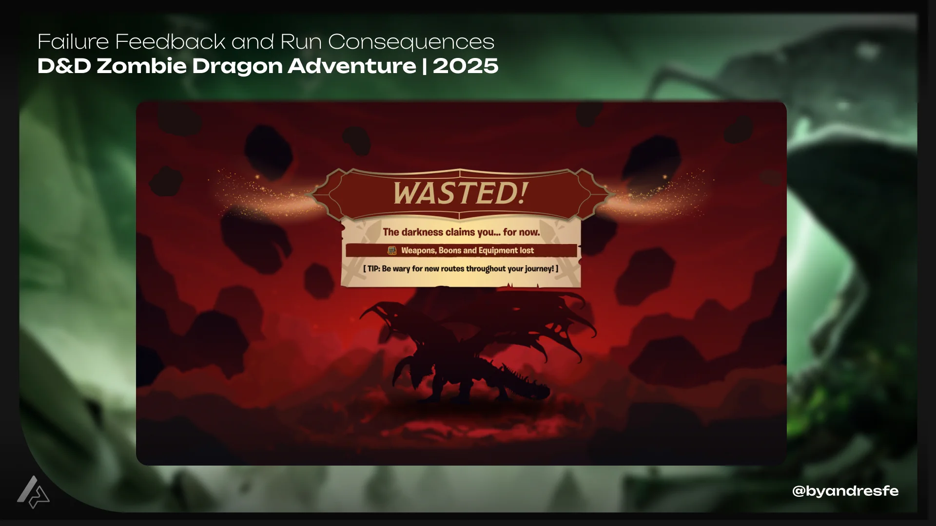
The project included playtests and internal feedback sessions. Those sessions helped identify navigation issues, critical experience bugs and moments where some features created more friction than value. Some features were removed or reduced because they added complexity without enough player value. The UX review also detected issues around system complexity, economy balance, accessibility and clarity for the target audience. Not every issue could be fully addressed within the production window, but those findings became important learnings for future projects.
What I learned
UEFN constraints are design inputs, not implementation problems. If you treat them as something to solve at the end, you end up with screens that look right in Figma and cannot ship. I started incorporating sizing rules, font limitations, and widget behavior into the system early. That made the handoff cleaner and saved cycles late in production. The other thing I took away: complexity costs more than you think at the feature level. Some systems looked interesting during design and created confusion for actual players in playtests. Knowing when to cut is as much part of the job as knowing what to build.
The UX work that mattered most on this project was not visible in the final screens. It was the information architecture that made the Adventure Book navigable, the FTUX structure that sequenced onboarding by action instead of explanation, and the documentation that kept implementation moving without constant back-and-forth. Player flows that account for how people actually enter an experience. Assets that hold up across different UI states. Documentation that engineering can work from. That is what I care about building.
If my work fits your team or project, reaching out should take less than a minute.